Smart Home App

HEXA POWER is a company that combines innovative technologies of solar energy and smart home functions.
  • Exercise given by “Codesigner” institution

My role

UI Design | UX Research & Improvements

Tools

Project Overview

HEXA POWER is an app that allows users to conveniently control their devices remotely from a single platform, be it a tablet or smartphone. In this project, I addressed UX challenges, conducting thorough research on smart home systems to design efficient control features for an optimal user experience. Guided by given tablet wireframes, I developed a new design language that complemented the chosen logo. Moreover, I crafted a responsive smartphone interface and implemented a dark mode across all screens. Additionally, I designed a user-friendly desktop dashboard.

Materials Provided

Codesigner provided us with 2 wireframes for tablet screens and a set of logos from which we selected one to create a design language. These are the home screen and the “Good Morning” scenario screen.

This is the logo I chose:

Competitive Analysis

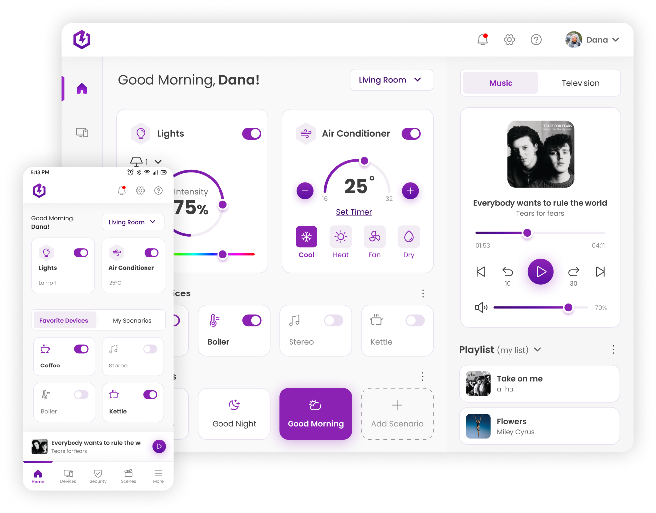
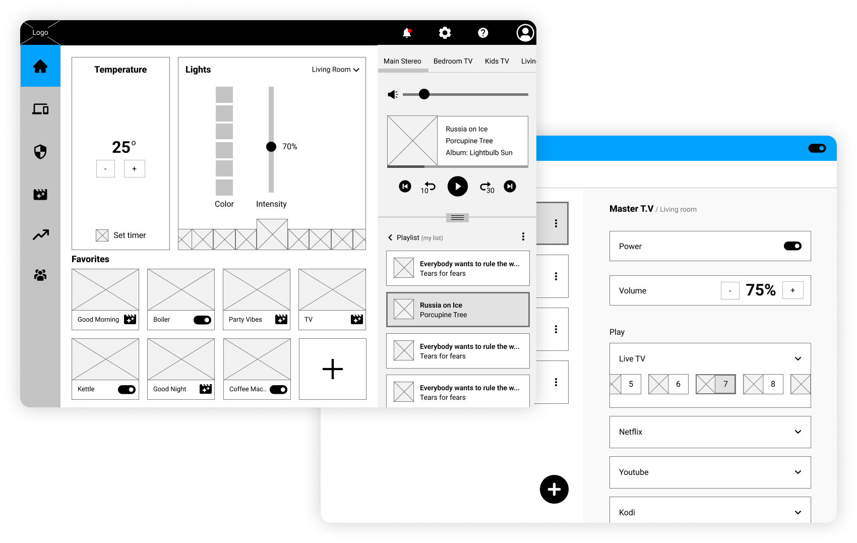
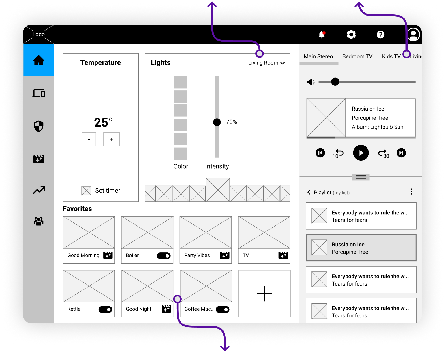
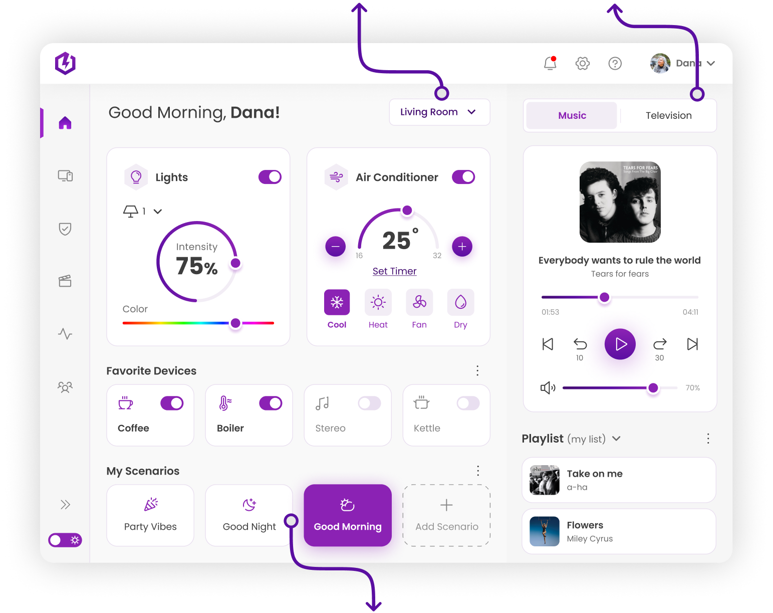
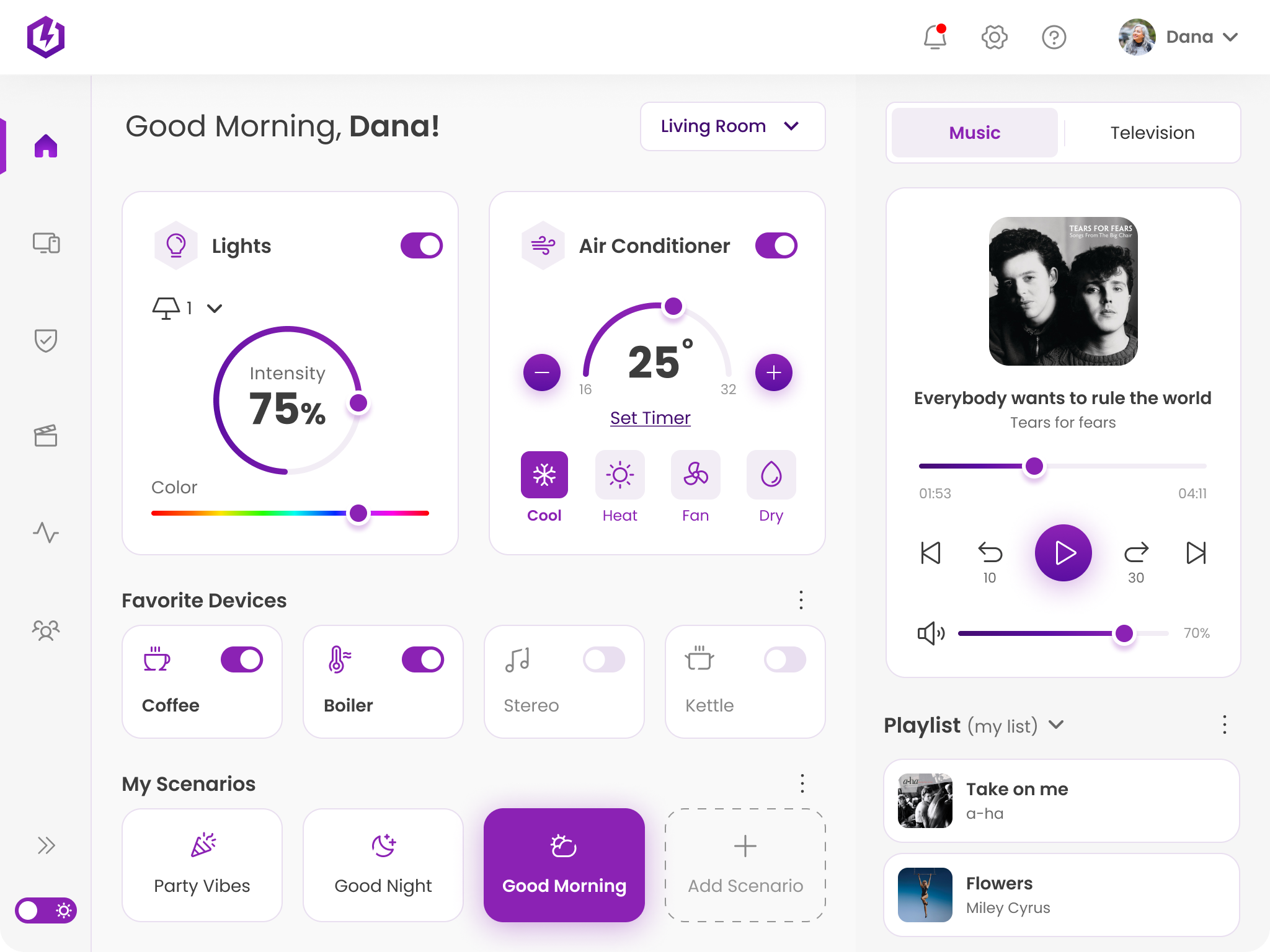
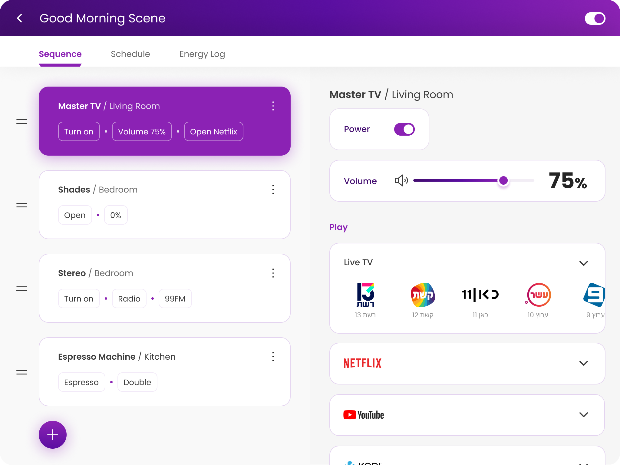
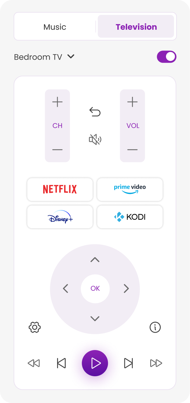
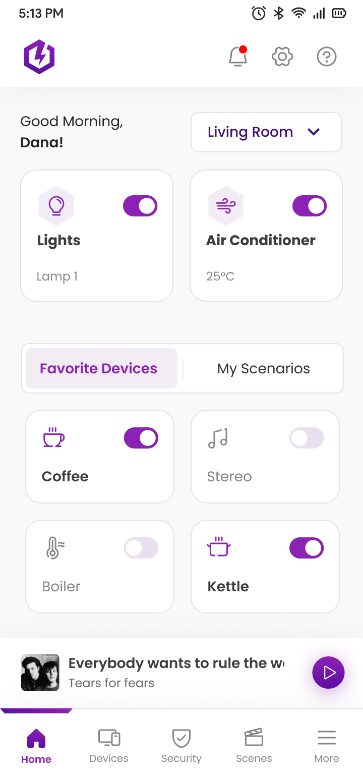
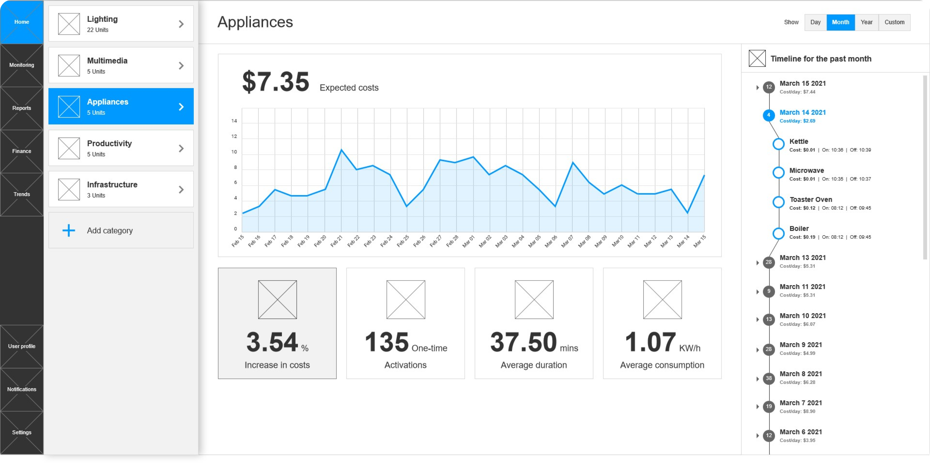
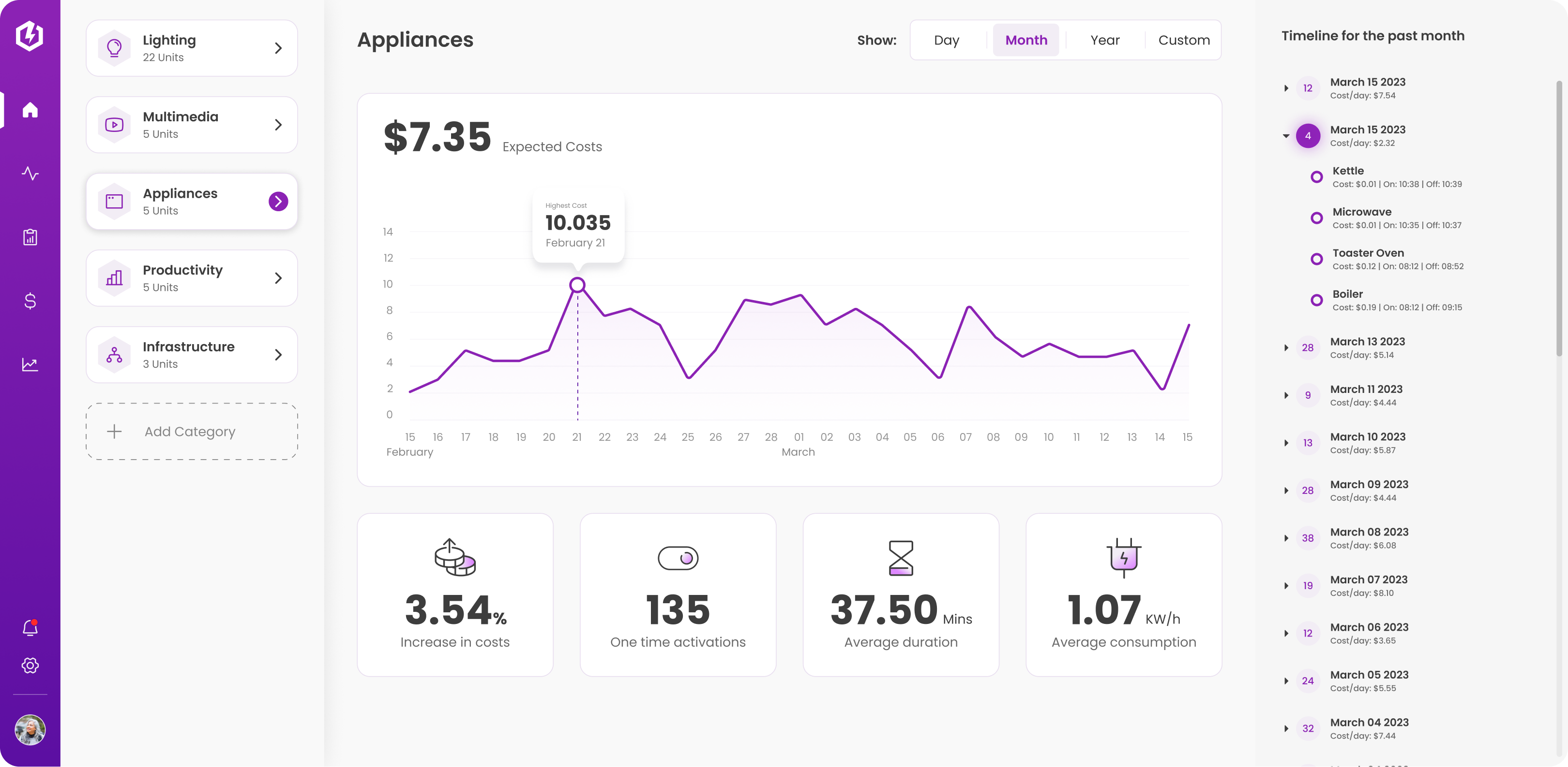
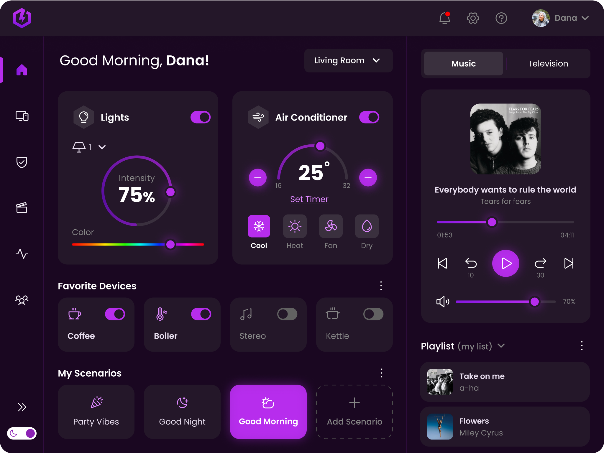
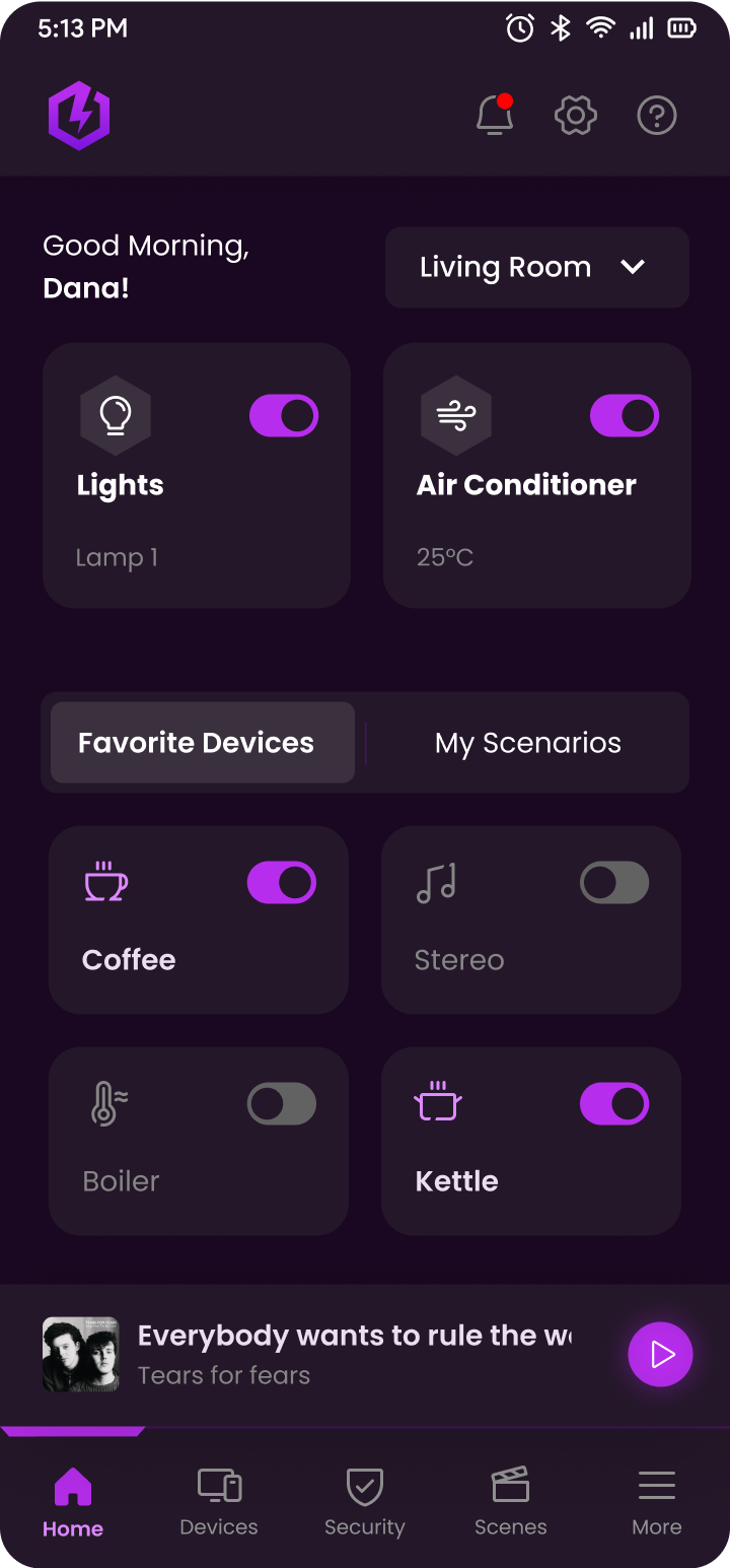
To gain a deeper understanding of the functionality, user experience, and flow of smart home apps, as well as to research their diverse range of features, I conducted a comprehensive comparison of several apps, aiming to identify their strengths and weaknesses.
Amazon Alexa
Olisto
Google Home
Yonomi
Samsung SmartThings

Insights & Changes

Only one card with room selection
Unnecessary cognitive overload
Devices and scenarios are grouped in the same place
Devices are grouped by rooms, minimizing the time needed to locate specific devices
Switching between music and TV to reduce cognitive overload
Separating devices and scenarios allows for improved organization and efficient access to the devices users regularly control

UI Design: Tablet

Home Screen

Good Morning Scenario Screen

Extras

To explain some of my decisions, I created two additional scenarios as shown below
To preserve a clean design and minimize cognitive load, I opted not to include text in the tab system. Instead, I incorporated an arrow that expands the entire menu when clicked.
After consolidating the numerous tabs into just two (music and TV), I aimed to show that no TV option was overlooked. To achieve this, I grouped them all under a dropdown.

Mobile

Desktop

In addition, we were tasked with designing a dashboard that will provide data on electricity consumption in different categories.

The UX provided by Codesigner

My UI Design

Dark Mode

Colors & Fonts

#FFFFFF

#F8F8F8

#F5F5F5

#868686

#6A6A6A

#3D3D3D

#F2EDF5

#8B22B4

#5A0EA1

#430D70

Gradient 1

Gradient 2

Icons

In the beginning, I created two types of icons inspired by the logo: Icons inside a hexagon and “broken” icons. Later, during the desktop exercise, I enhanced the “broken” icons by adding gradients to give them a more sophisticated look, taking advantage of the available space.

Thanks for watching!

What if Strauss+ and Yad2 had a baby?
© All rights Reserved. Dana Zavurov