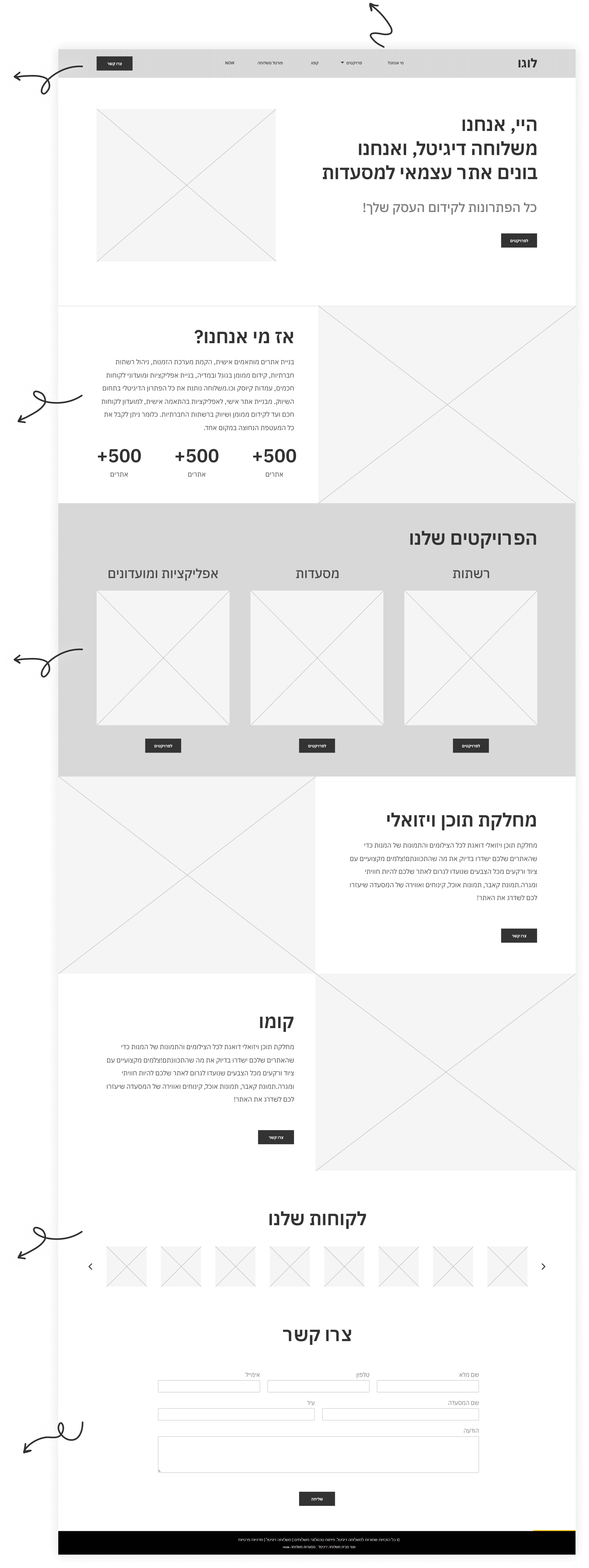


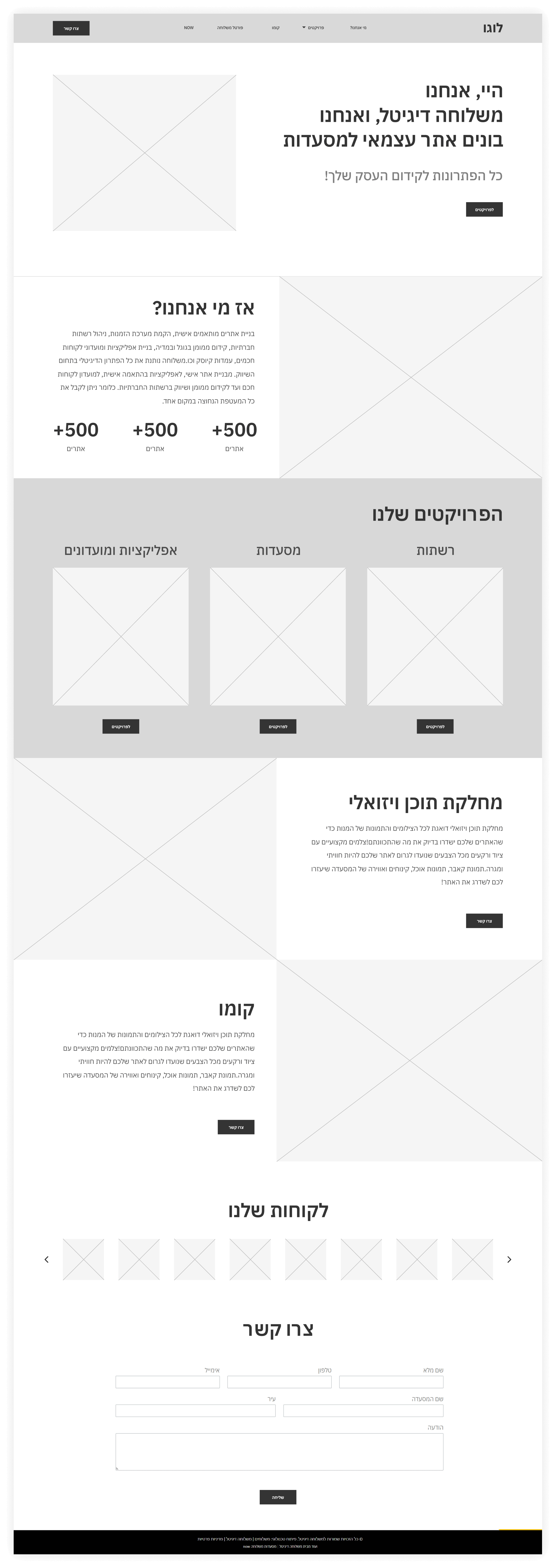
I removed irrelevant tabs and merged them into relevant subgroups to reduce cognitive load on users.
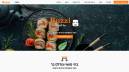
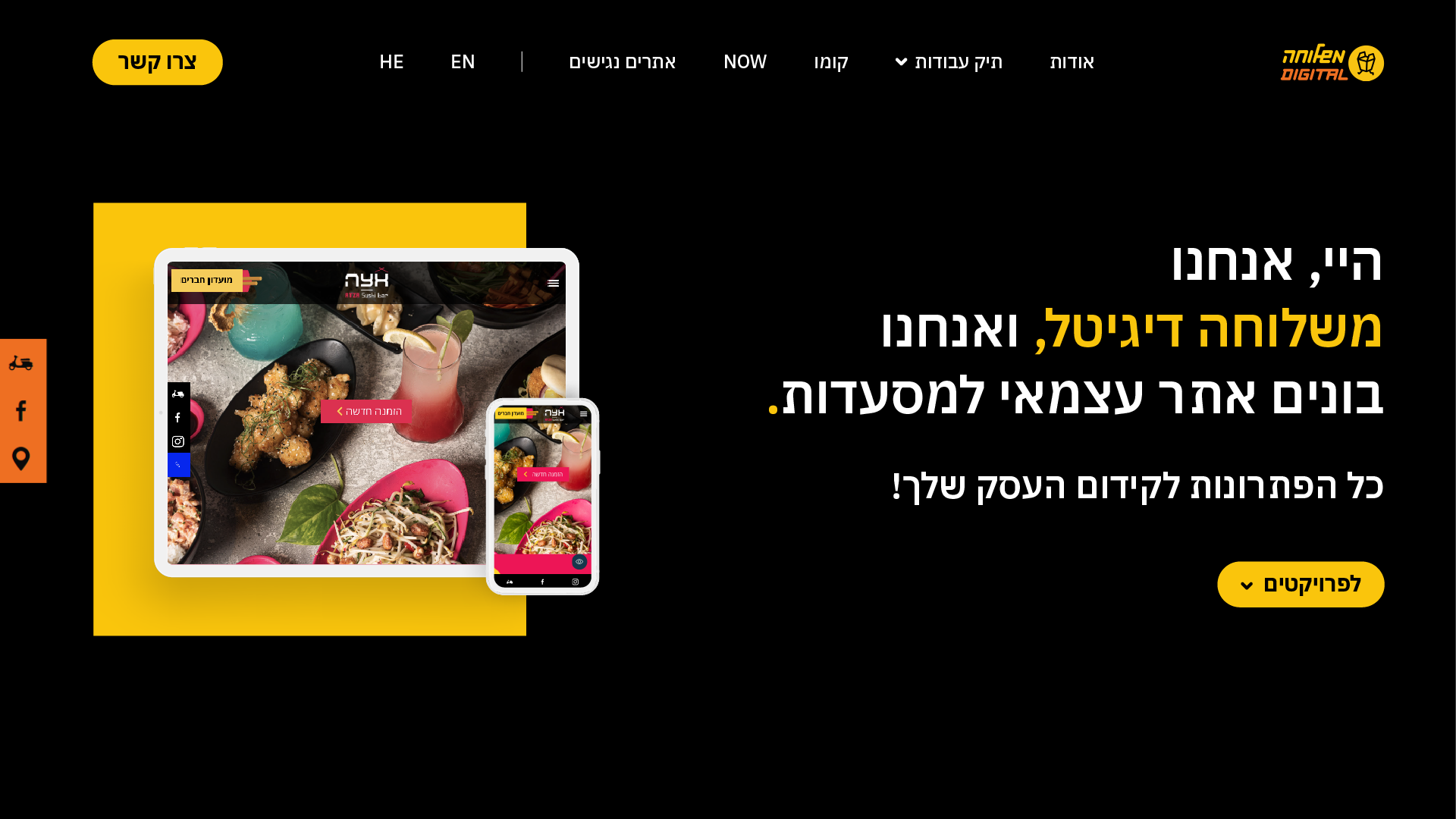
The main goal was to establish contact with new customers of "Mishloha". To achieve this, I emphasized the "Contact Us" button on a sticky header, ensuring that this option is always accessible to visitors.
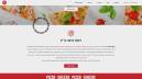
I added an "about us" section to connect with visitors on a deeper level, and establish a positive brand image that fosters trust and engagement.
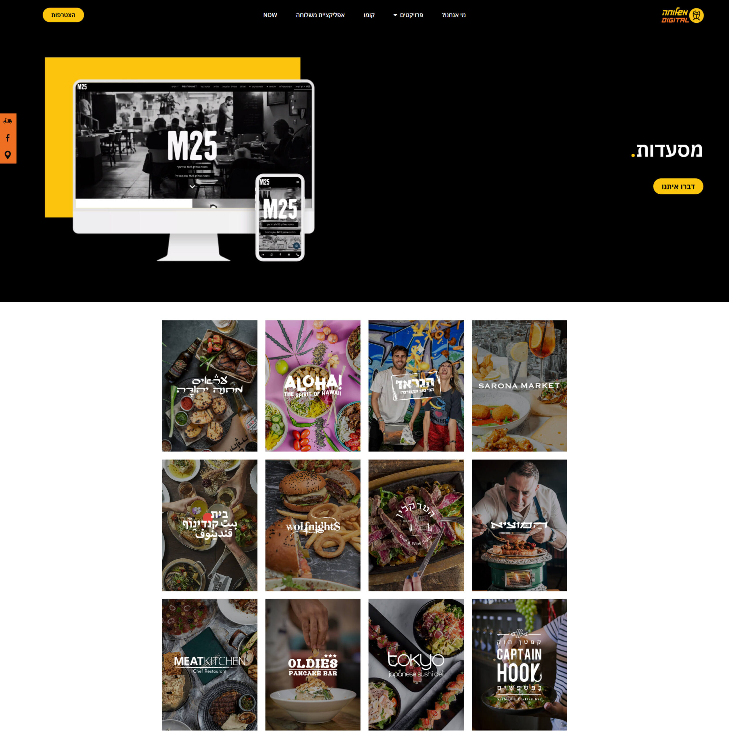
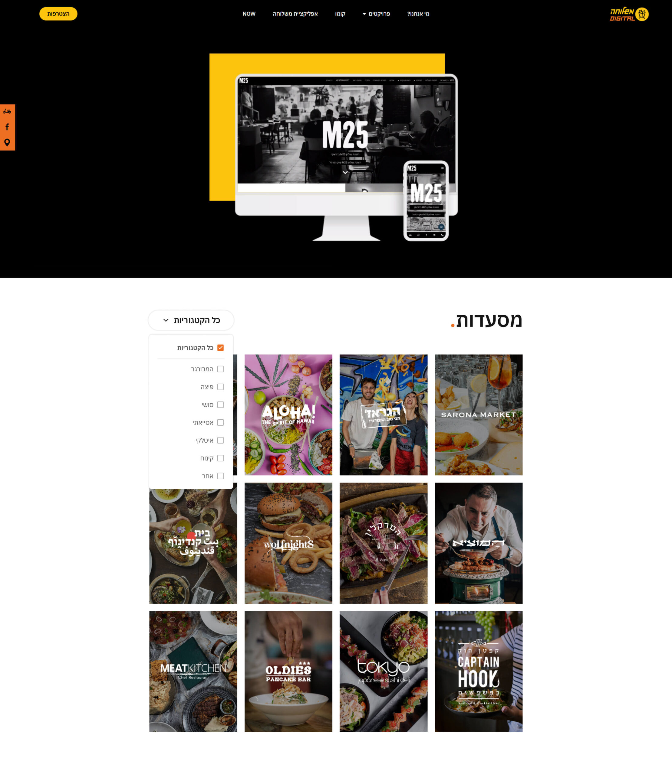
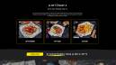
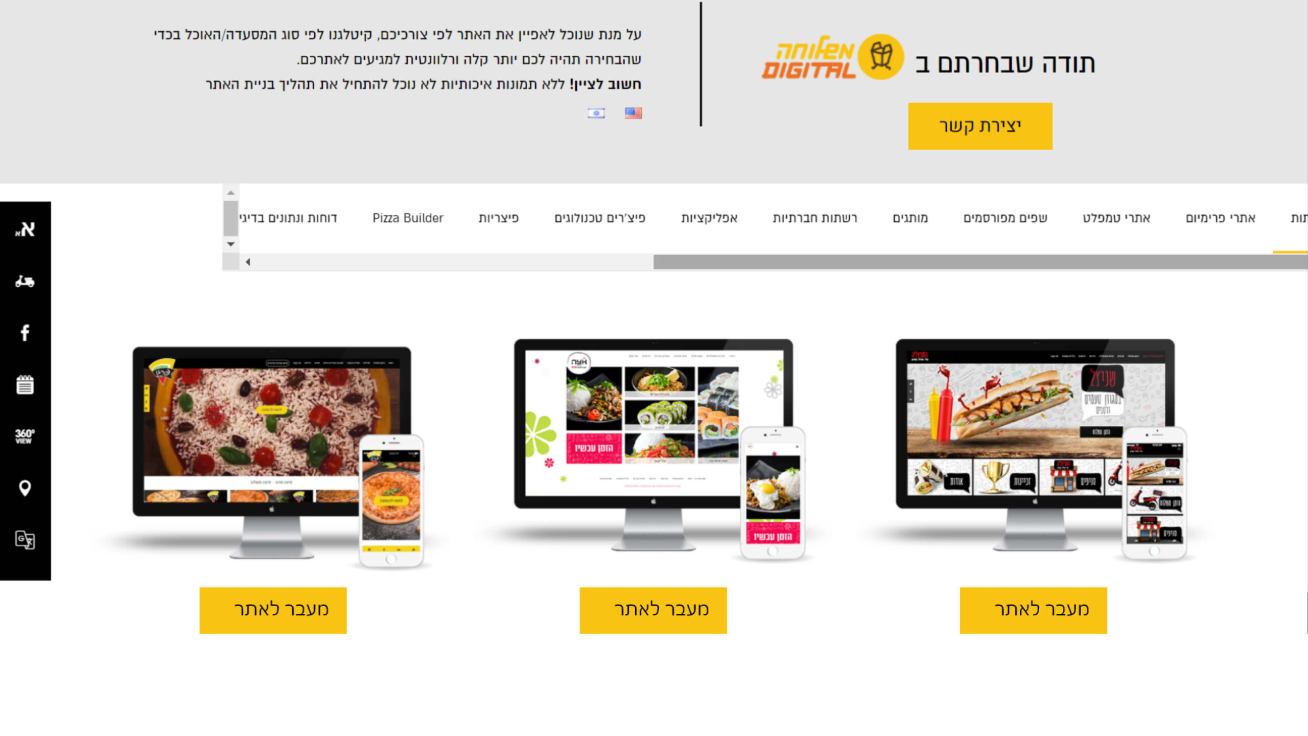
I divided the projects into three categories so that users can choose to view what best suits their needs.
For building credibility, I added an “Our Customers” section.
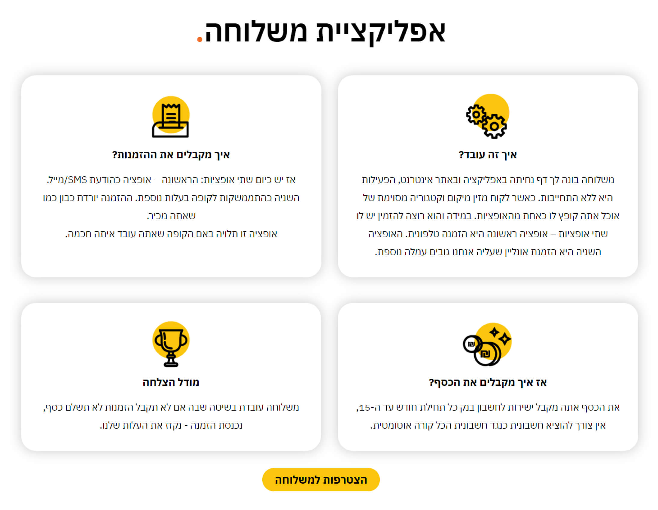
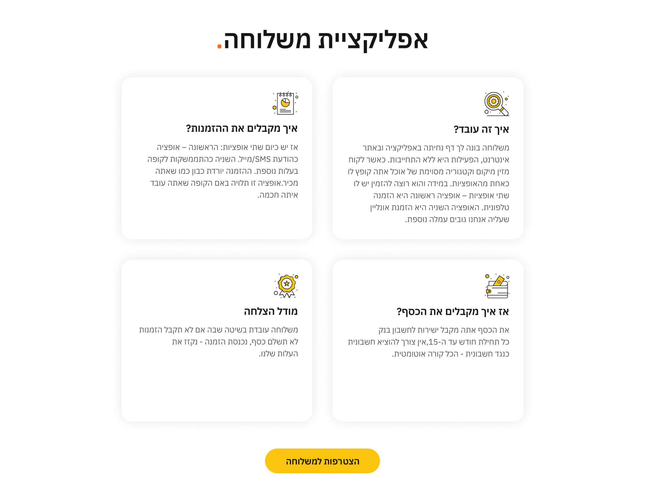
Visitors can smoothly navigate through the website's content, absorb information, and then seamlessly transition to the contact form when they are ready to engage with the business.