EscaPro is an escape room app – Find, book, and track escape rooms.

My role

Concept | Research | UX/UI Design

Tools

Project Overview

During my studies at Codesigner, we were tasked with designing an app aligned with our passions. It was clear to me then that my focus would be on escape rooms.
Having played in over 200 escape rooms, worked as an operator, and built connections in the enthusiast community, I felt well-equipped to identify challenges in the field and develop tailored app solutions.

The Problem

The process of finding, booking and tracking escape rooms is scattered across several different platforms, which are not synchronized with each other. This causes a lot of confusion and makes the process long and tedious.

The Solution

An application that handles the entire process of finding, booking, and personal tracking of escape rooms, including special features such as room comparison, badges, and a “surprise me” button.

User Research

My target audience consisted of escape room enthusiasts (“escapers”) aged 18-50. I conducted 5 interviews tailored to this audience to better understand their pain points.

Main Insights

Same platforms for the same needs
Scattered processes & lack of synchronization
Reliable reviews are crucial
Frequent spontaneous reservations

Competitive Analysis

Morty
Escaper
Escaped

Strengths

Morty
  • Consistency
  • Clear and intuitive navigation
  • Delightful elements like GIFs and icons
  • Effective communication and feedback loops
Escaper
  • Clear orientation
  • Intuitive website experience
  • Partial communication and feedback loops
Escaped
  • Consistency
  • Clear and intuitive navigation

Weaknesses

Morty
  • Unconventional icons
  • No room documentation
Escaper
  • Unconventional large tab system
  • Icons disappear within the tab system
  • Sloppy and outdated design
  • No room documentation
Escaped
  • Challenging website registration – no existing account integration
  • Small menu causing false taps
  • Dull design

Conclusion

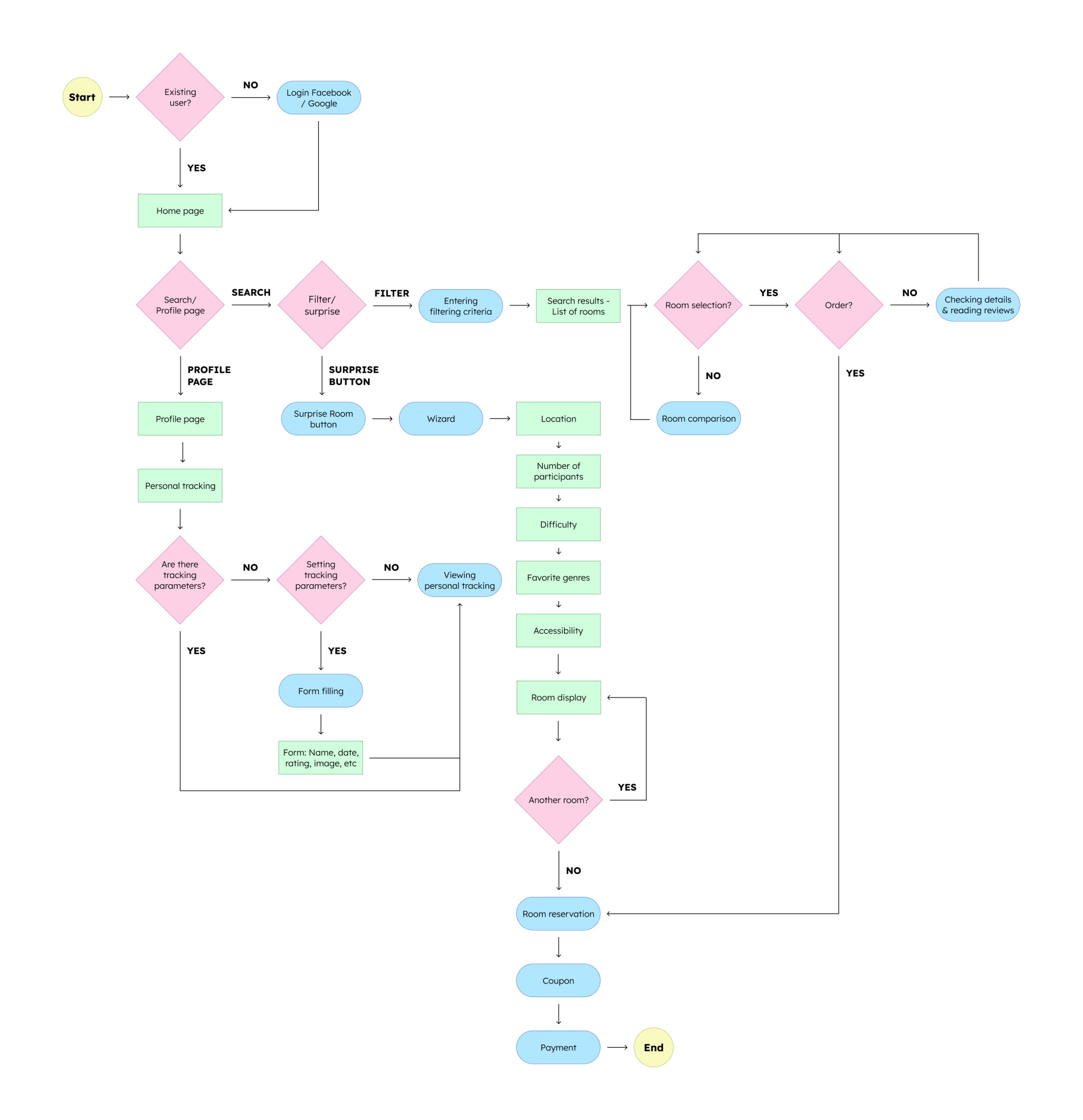
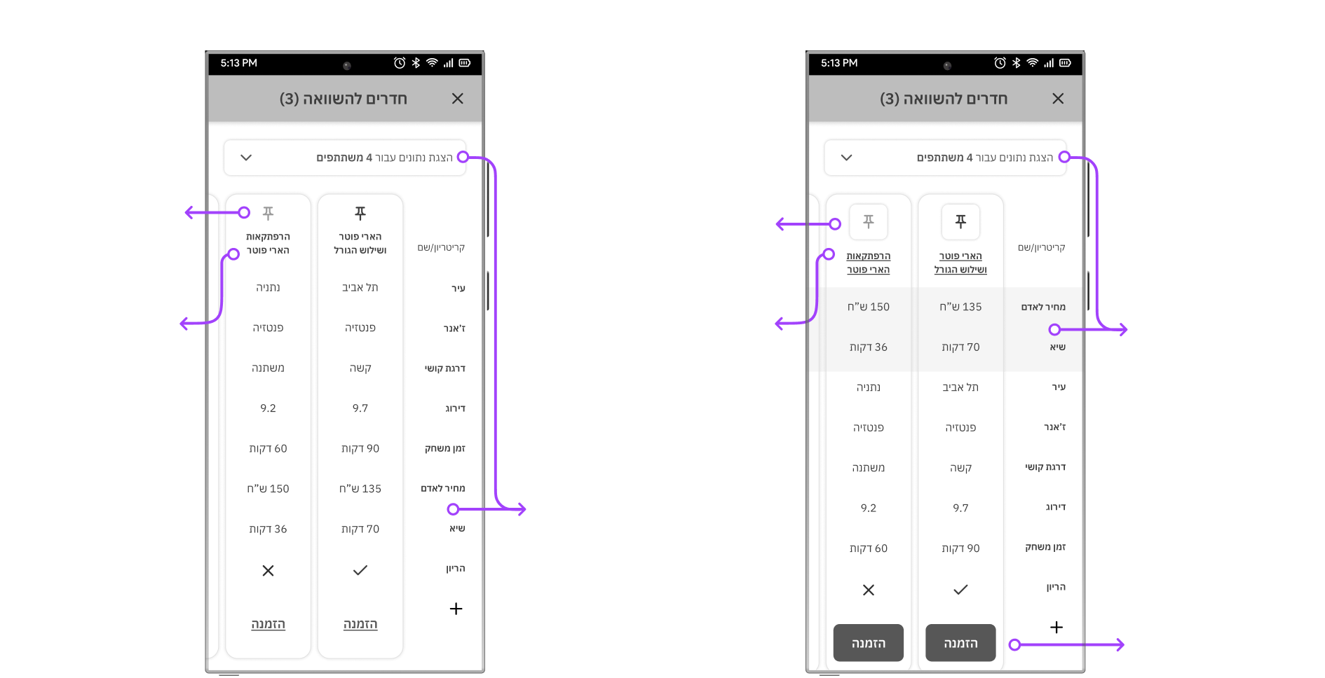
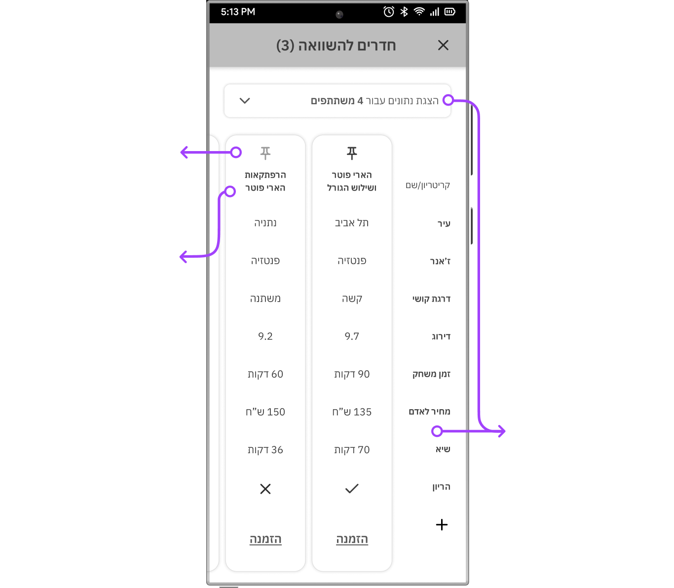
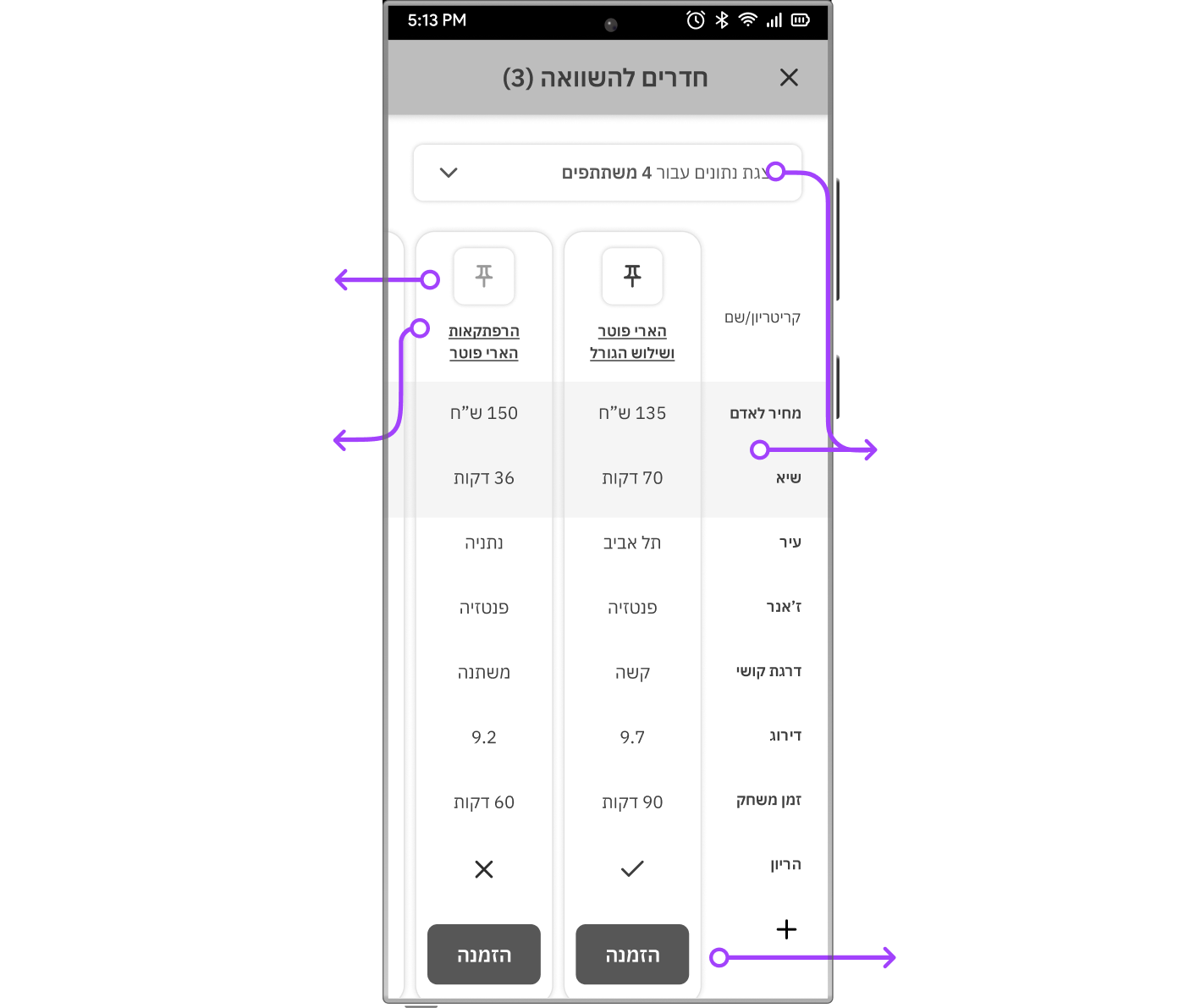
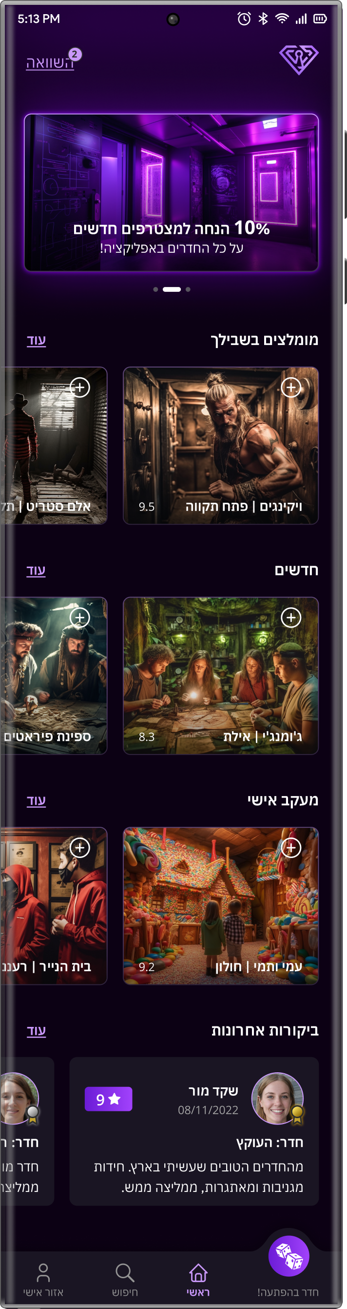
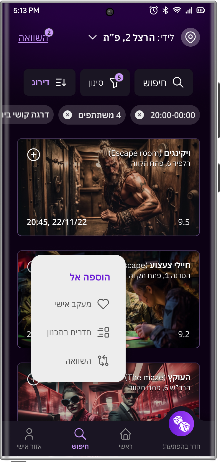
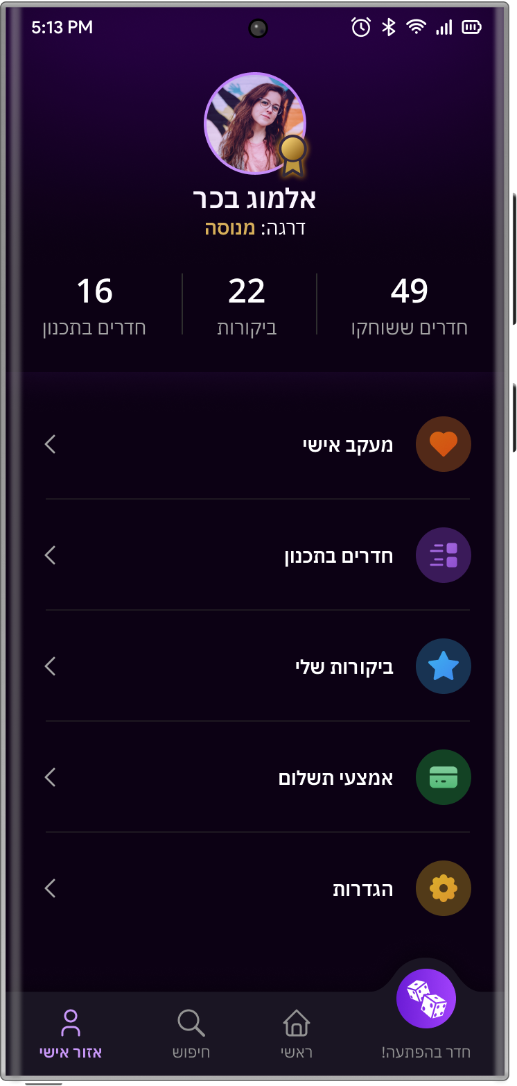
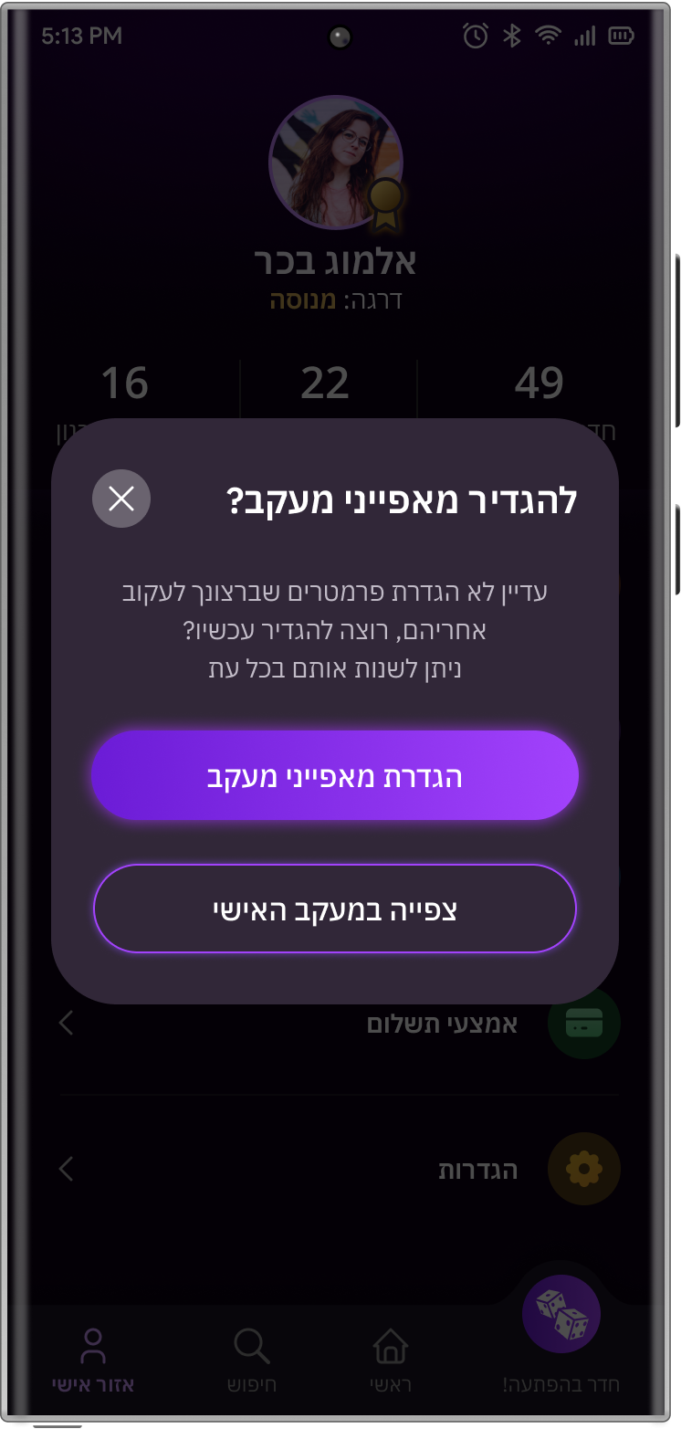
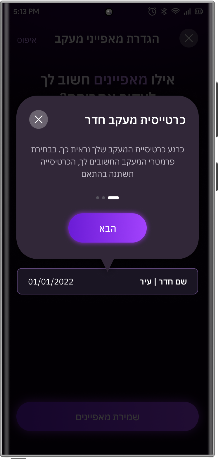
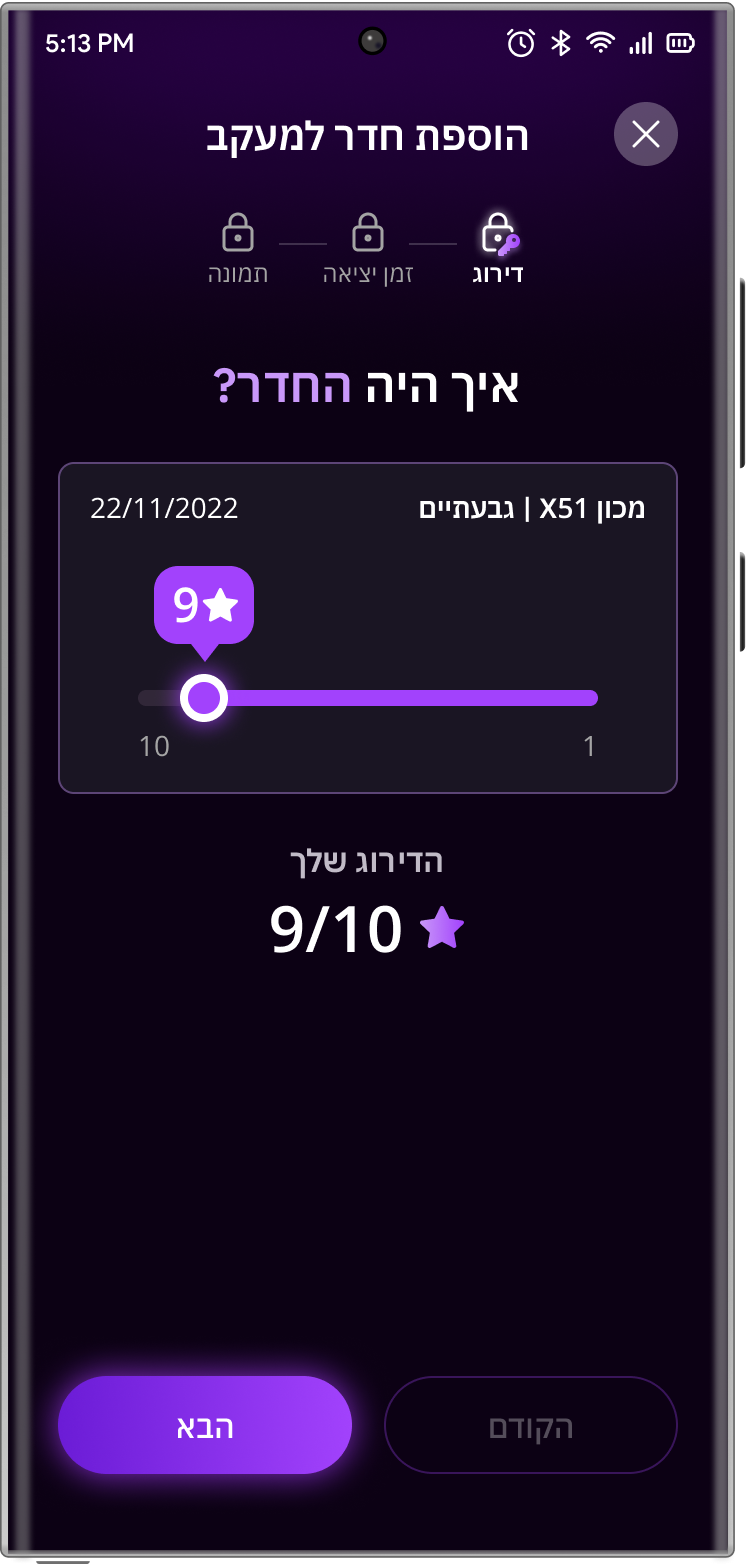
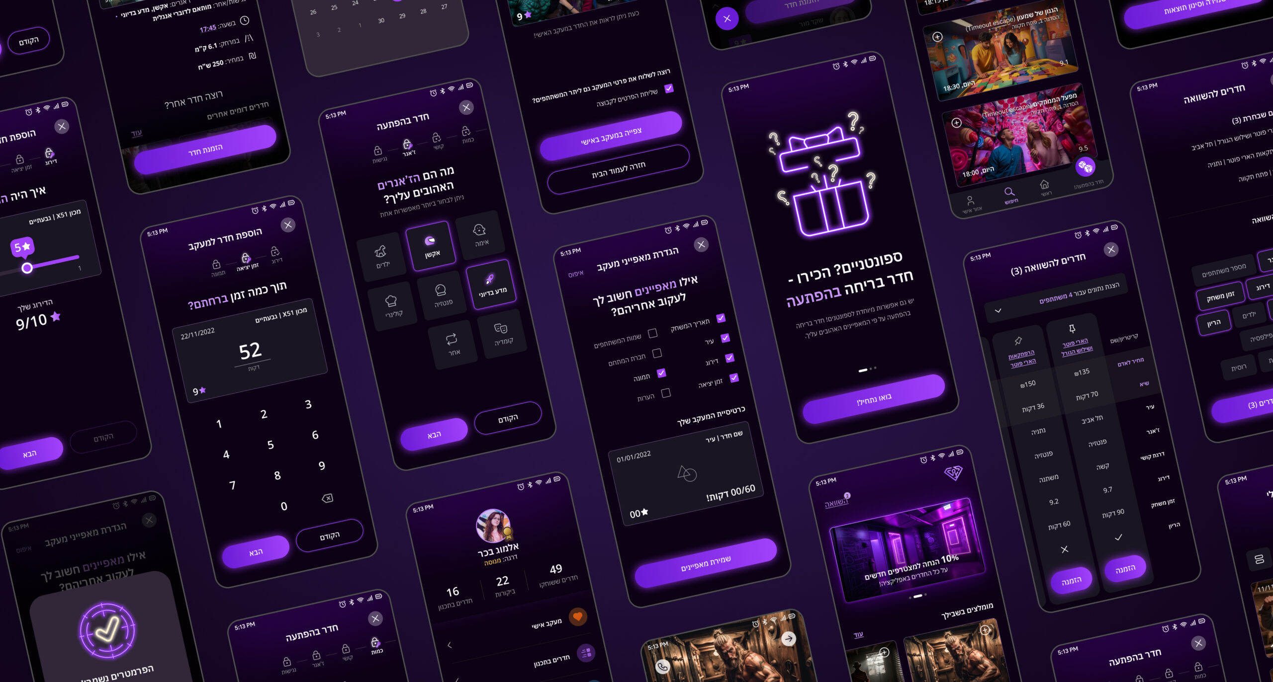
Presently, no escape room app streamlines all processes (finding, booking and personal tracking of escape rooms). Most apps concentrate on a single process, which, even then, I find intricate due to numerous stages, outdated interfaces, and navigation that, while functional, falls short of optimal. Additionally, reviews and comparisons are absent in the majority of apps.

The Persona

Almog Bachar

27 years old | In a relationship with Shaked | Full Stack Developer

Currently, I search on one website, book on another, and keep track of all the rooms I've done in a completely different place. It's not intuitive and just feels chaotic, especially when the websites are not synchronized with each other.

Bio

About half a year ago, Almog tried her first escape room with her boyfriend. Now, it’s become a major hobby for her, with 49 rooms under her belt. She often books rooms spontaneously after hanging out with her boyfriend or friends and meticulously documents each visit. While she loves her new hobby, she struggles with the scattered and frustrating processes involved.

Pain Points

  • The process of finding, booking, and tracking rooms is distributed across multiple platforms
  • synchronization issues, such as new rooms not being displayed, occupied slots appearing vacant, and more
  • Prolonged and laborious procedures
  • The absence of mobile optimization
  • Getting reviews and relevant information about the rooms is scattered across diverse sources

User Flow

The Wireframes

Usabillity Testing

I conducted 3 usability tests with individuals who are part of my target audience

The UI Screens

1. Onboarding

2. Home page

Two rooms currently appearing on the comparison screen due to their addition in previous app sessions
More Midjourney images

I created all the app images using Midjourney

The prominent “Surprise Me” button holds paramount significance in terms of enhancing the user experience and fostering product thinking. It facilitates easy access for spontaneous escapers (as identified in my interviews) and promotes bookings to prevent unutilized slots, thus providing support to the industry

3. Find a room process

4. Add to comparison

5. Comparison

Dynamic information: Adjusts based on number of participants

Displaying three rooms, with the rightmost one being sticky. Any room can be pinned at any moment by clicking the pin icon. Rooms on the left can be swiped horizontally

6. Surprise me!

7. My profile page

8. Pop up - set parameters

If there are no tracking parameters yet, clicking on “Personal Tracking” will open a pop-up where the user is prompted to set them

9. Guided tutorial

Setting up the parameters is an uncommon process, thus users go through a guided tutorial consisting of three steps regarding the tracking card.

10. Setting tracking parameters

Users can select their preferred parameters within the card, which updates in real-time based on their choices. These chosen parameters are filled out by the user at the end of each room

11. Room rating

From interviews and research, I learned that escapers typically rate rooms up to 10. Due to mobile screen constraints, I chose a slider-based rating method.

12. Room tracking

The UI Kit

Components & Icons

Color palette

#5D4577

#6B1CD6

#8F00FF

#A242FC

#C998F9

#0C0114

#1A1523

#A4A4A4

#B9BEC2

#FFFFFF

Typography

IBM Plex Sans Hebrew

Header 1 | כותרת - Semi bold. 24 pt

Header 2 | כותרת - Semi bold. 20 pt

Body text | טקסט רגיל - Regular. 14 pt

Small text | טקסט קטן - Regular. 12 pt

אבגדהוזחטיכל
מנסעפצקרשת

Thanks for watching!

Redesign the company’s portfolio, showcasing the websites designed by the studio.

© All rights Reserved. Dana Zavurov