A comprehensive platform integrating attendance, payroll, and pension into a unified system.
My Role
As the lead UX/UI designer within the design team, I was responsible for user research, wireframing, high-fidelity UI design, and developer handoff, focusing primarily on the employee-facing attendance module with some consideration for the manager’s perspective, while laying the groundwork for the payroll and pension modules.
- Note on confidentiality: Certain elements such as the client’s name, logo, and identifying details have been intentionally omitted. Thank you for your understanding.
About the Company
A leading Israeli tech group providing IT services and digital products, including advanced payroll, attendance, process management, and an employee portal.
Project Objective
Create a unified platform integrating internal systems – attendance, payroll, and pension – with user experience and designs aligned to the brand.
The main challenges
Audience & User Needs
Dual User Roles
System must serve managers and employees with different workflows
Multiple User Segments
Diverse groups with unique needs require adaptable solutions
Change & Adoption Challenges
Balancing Improvement with Familiarity
Long-time users are accustomed to outdated workflows and UI. Upgrading to a modern, user-friendly experience without alienating them required a careful balance between innovation and familiarity
Differentiation
Needed to stand out from existing internal systems while preserving key workflows familiar to the audience
User Research
The Processes
I conducted ten in-depth interviews, both in-person and online, with target users. In parallel, I observed users as they reported their attendance, allowing me to capture both their experiences and real-world challenges.
This process revealed three distinct user segments and key insights that shaped the project direction.
- Images are taken from the observation process, with personal information blurred to ensure privacy.
“Most of this info isn’t really relevant to me.”
“I wish I could do this from my phone if that were an option.”
“I forgot my card and now I have to enter it manually.”
“I end up calculating the standard myself since there’s no indication of what it is.”
The Interface Creates More Friction Than Flow
Most interviewees
Reported that mobile is their preferred platform, yet the interface is poorly optimized for it.
Several participants
Described the amount of irrelevant information as overwhelming and distracting.
Some users
Felt the long list of correction reasons was overwhelming, including irrelevant options and missing appropriate ones.
Multiple participants
Pointed out the lack of standard views by month, week, or project.
High Complexity, Low Clarity
The system’s interface overwhelms users with irrelevant or unclear elements, lacks guidance, and fails to adapt to their preferred usage patterns – resulting in a cumbersome user experience.
Workflows Create Inefficiency
Most interviewees
Reported the need for daily manual checks to identify missing entries.
Several participants
Mentioned a lack of real-time synchronization or delays in receiving updates from managers.
Many reported
That when missing entries are found close to payroll closure, it’s difficult to recall the exact hours worked.
Low Efficiency, High Effort
Frequent manual checks, poor synchronization, and last-minute corrections create unnecessary effort and reduce overall workflow efficiency.
Main Insights
Tailored Mobile &
Web Experiences
The mobile app should focus on fast, easy punch-in/out, while the web platform should prioritize editing work hours and approving monthly records.
Essential &
Customizable Data
Show only the information employees need during the monthly attendance review, with an option for those who want more detailed, personalized data.
Proactive
Notification System
Implement alerts to prevent retroactive corrections and reduce the need to repeatedly check request statuses (e.g., sick leave or vacation).
Persona
Scroll
Three Main Employee Segments
Regular Employees
Project-Based Employees
Shift Workers
Reporting Method
Punch card / badge / mobile app / system
Mobile app / system
Punch card / badge / mobile app / system
Working Hours
Fixed daily working hours
Hours tracked and allocated to specific projects
Predefined shift schedules set in advance
Reporting Time
Defined start and end times for the workday
Logged daily at the end of each workday
Defined start and end times for each shift
Conclusion
Each segment has different requirements for how data should be displayed, making it essential to offer tailored views for each employee type, while allowing each organization to choose the most relevant layouts based on its workforce composition.
Personas Based on the Three Employee Segments
Main Persona: Regular Employee (Hybrid work, 8–17 schedule)
Maya, 26, Administrative Assistant
Pain points
- Fingerprint issues lead to missing entries, requiring manual end-of-month corrections.
- Long login times on the desktop system.
- Overload of information causes visual and cognitive strain.
Expectations
- Accurate, reliable, and focused information.
- Real-time alerts for any error or change.
- Quick punch-in and punch-out updates.
Secondary Persona: Project-based Employee (Hybrid work, 8–17 schedule)
Tal, 34, Lawyer
“Sometimes I rush home and forget to log my hours, and the next day I struggle to remember the exact project hours.”
Pain points
- Logging hours per project can be tiring, and there isn’t always time to enter everything the same day.
- When multiple projects go unlogged, it’s hard to recall details later.
- Monthly and weekly attendance requirements are unclear.
Expectations
- Quick and easy way to log project hours.
- Simple and fast data analysis.
- Clear display of weekly and monthly requirements.
Secondary Persona: Shift Worker (Morning, Evening, or Night shifts, variable schedule)
Anna, 46, Nurse
“It’s sometimes hard to keep track of my actual hours, especially when I swap shifts with a colleague.”
Pain points
- Shift swaps make it difficult to track actual hours.
- The system doesn’t clearly show special compensations like night, weekend, or holiday pay.
- Planning future shifts in advance is challenging.
Expectations
- Weekly shift schedule view with the ability to request changes.
- Clear calculation and display of overtime and special compensations.
- Comparison of required vs. actual hours.
- Ability to request shift swaps directly through the system.
Competitive Analysis
Scroll
Hilan
Hibob
Hercules
Malam
Display
Combined table and calendar on the same page
Table view
Option to switch between table view and calendar
Table view, full month shown by default
Default View
–
Descending order (current date → 1st of month)
–
Ascending order (1st of month → current date)
Wide Range of Capabilities
Suitable for Multiple Segments
Modern Interface
Easy Navigation
Clear Hierarchy
Notification System
Mobile Compatibility
Conclusion
The optimal system should combine comprehensive capabilities that cater to a wide range of segments while maintaining a clean, uncluttered interface, an intuitive user experience, and a modern, visually pleasing design. It should allow users to customize the information display according to their needs and provide a proactive alert system to streamline workflows.
The current system
Currently, the system treats all users the same – ignoring both the variety of user segments with different needs and the critical separation between employees and managers.
Additionally, the client reported that certain departments had transitioned to an alternative internal company system using a calendar-based interface. While younger employees adapted well to this change, veteran employees struggled with the transition from their familiar table format, highlighting how established user habits can resist even improved interfaces.
Given that users preferred familiar interfaces, I therefore expanded the competitor research to include indirect competitors like Monday, ClickUp, and Jira. These platforms showcase sophisticated table designs while incorporating modern UX principles. Key insights emerged around hover-based details, flexible table customization, and internal scrolling with sticky headers.
The Solution
1. Audience & User Needs
Key Actions
- Creating tailored specifications for each main employee segment. Since every segment has different needs, each one receives a dedicated solution. Companies will implement the system with only the relevant segments, preventing unnecessary complexity for all users.
- For the MVP, we focused on regular employees with standard 9-hour shifts, targeting only the employee interface to validate core functionality before expanding to additional user segments and managerial features.
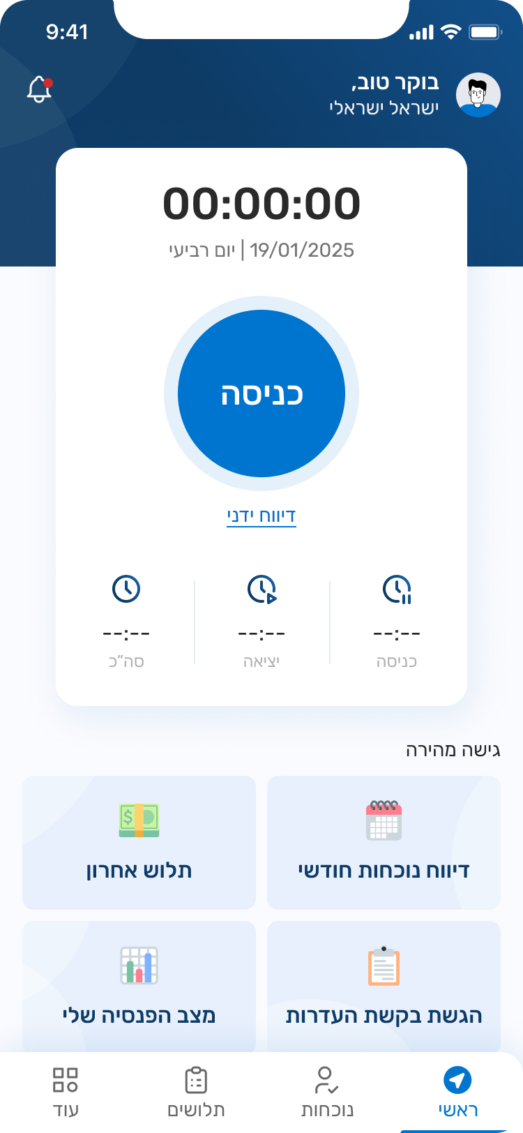
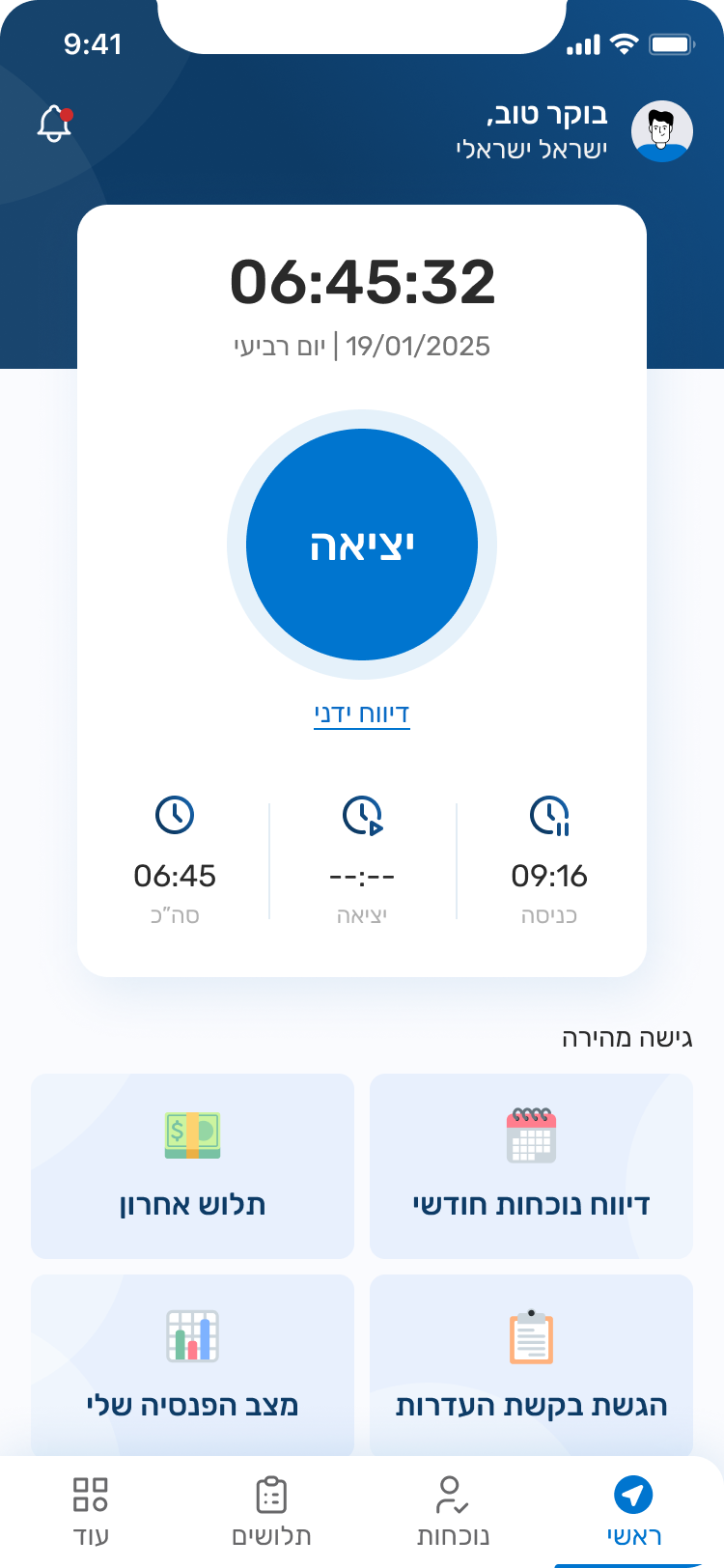
Starting from the employee perspective only, since every manager is also an employee. This ensures that all core functions are unified, with managerial additions placed in one centralized location.
Adding a dedicated scheduling module for shift workers, as they require special handling due to their unique complexity compared to regular and project-based employees.
2. Balancing Improvement with Familiarity
Key design improvements
Dual interface options – calendar vs. table view to accommodate different user preferences
Significantly reduced visual clutter with flexible column customization as needed
Date sorting options – ascending/descending for user convenience
Clear standard hours display
Clear visualization of missing entries
Entry, Exit & Notes Input
Customizable Table Features
Sub-entries
3. Differentiation
The third solution addressed differentiation on the manager’s side – standing out from existing internal systems while preserving familiar workflows.
Conflicting Absences Popup
When an employee requests time off, managers can now see overlapping requests from other team members. The previous system only showed employee names and dates. The new “Conflicting Absences” popup displays:
- list of employees with overlapping time off
- detailed dates
- total conflict days
- status and direct links to pending requests
This upgrade enables managers to better understand the implications of approving or rejecting requests and prevent understaffing situations.
Conflicting Absences Popup
A “Future Vacations” popup provides managers with comprehensive insight into each employee’s upcoming time off. Alongside the current request, it displays:
- list of future vacations
- days per request
- status
- current balance
The system performs smart calculations showing projected balance assuming all requests are approved, calculated through the latest month of the most recent approved vacation, allowing managers to anticipate how decisions will impact future leave balances.
3. Mobile Adaptation
The entire team collaborated to define the main mobile lobby based on our collective research findings, following the client’s request to prioritize the mobile app experience first
Central Action – As most interviewees mentioned that they prefer clocking in and out via mobile, and others expressed a wish to have this option, the home screen was designed with a large, central button as the primary action. The screen also displays entry time, exit time, and total hours, with an option for manual reporting.
Quick Access – We introduced four customizable “quick access” buttons, tailored to each organization’s and employee’s needs. These shortcuts cover the most common and essential actions, as revealed through our research and interviews.
Persistent Timer – On all other pages, the timer remains visible in a compact form. This ensures it does not interfere with other tasks, while still allowing employees to easily stop it whenever needed.
Reminder Alerts: Notifications appear when users forget to clock in or out, allowing quick access to correct their entries.
Usability Testing
I conducted 3 usability tests, asking participants to think aloud to better understand their thought processes and challenges
Before
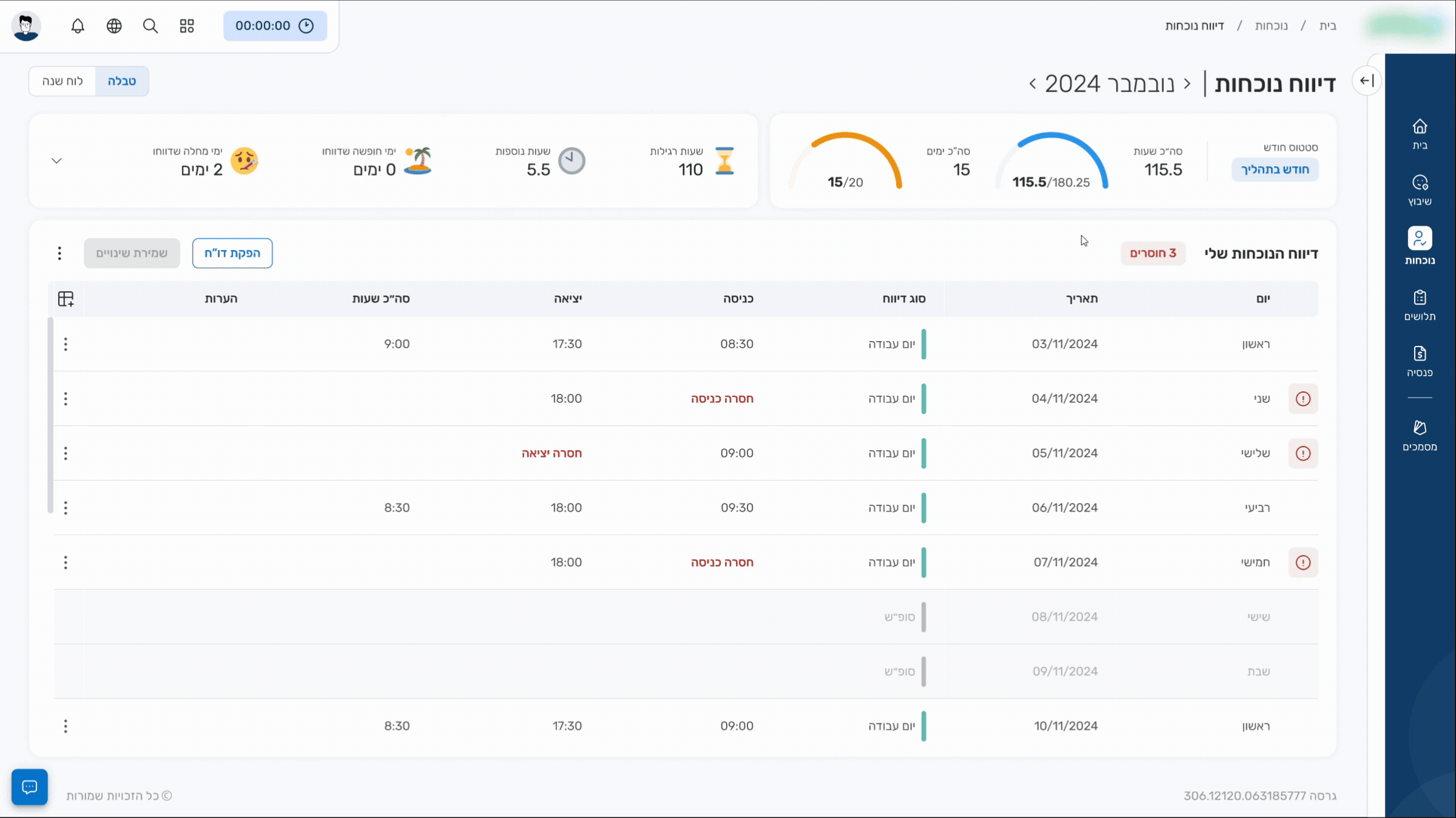
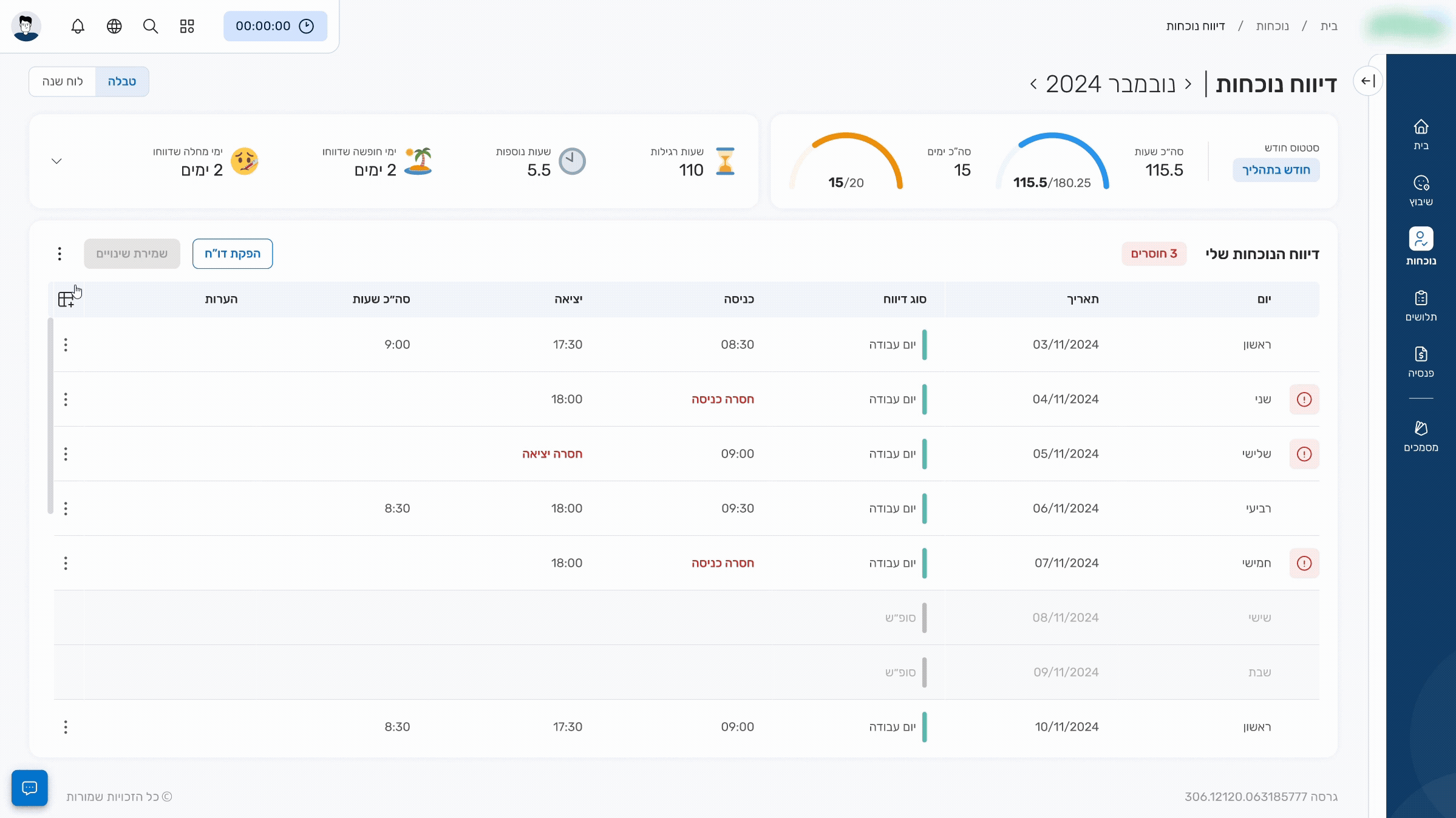
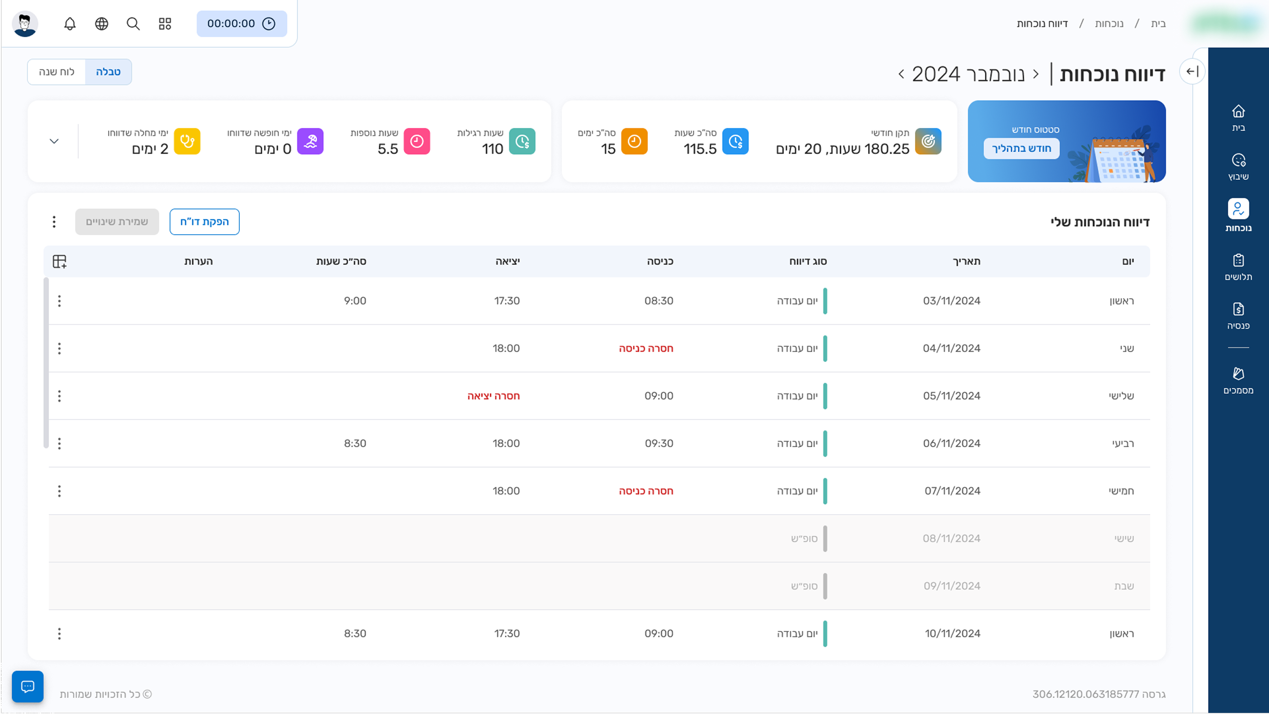
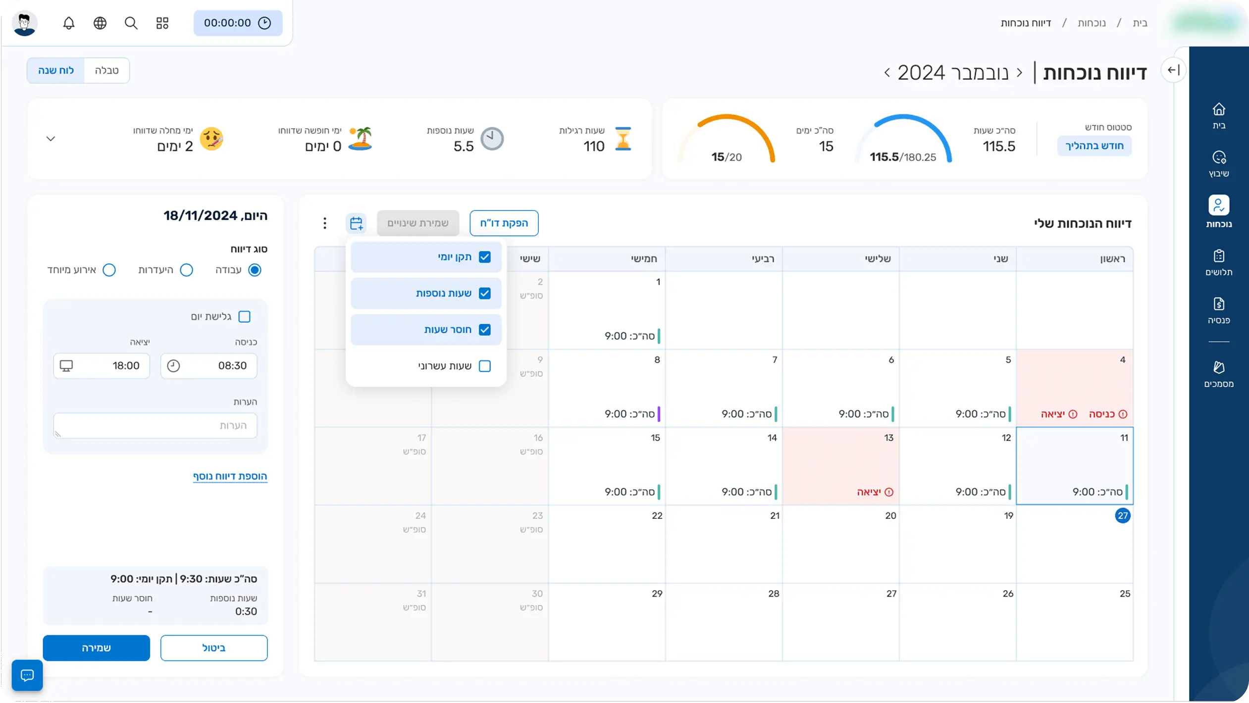
Remaining Hours Calculation: Participants struggled to calculate how many hours they had left for the month
Standard Hours Confusion: Users understood the worked-to-standard hours ratio but took longer than expected to process it
Visual Hierarchy Issue: Users consistently noticed this element first and spent too much time on it, likely due to it being overly prominent
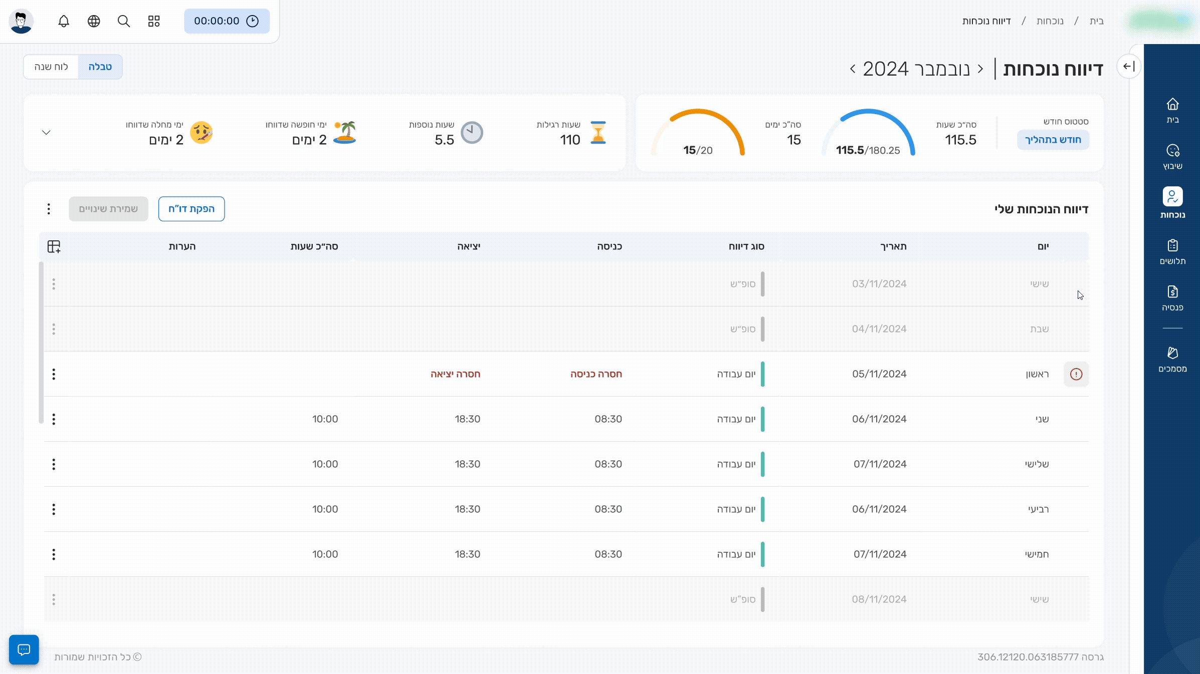
Missing Entries Oversight: All users successfully entered attendance data but failed to notice additional records requiring correction below
After
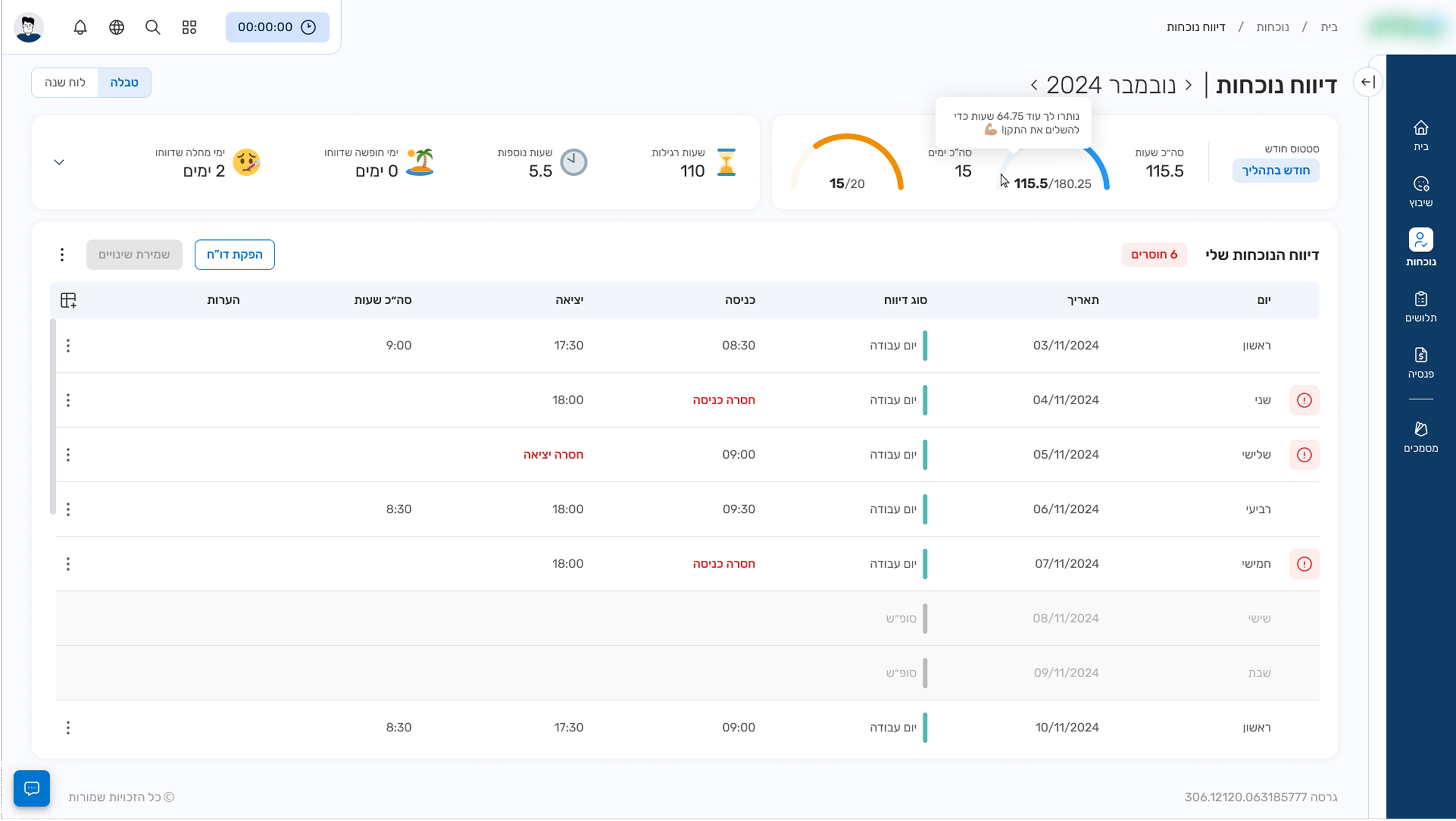
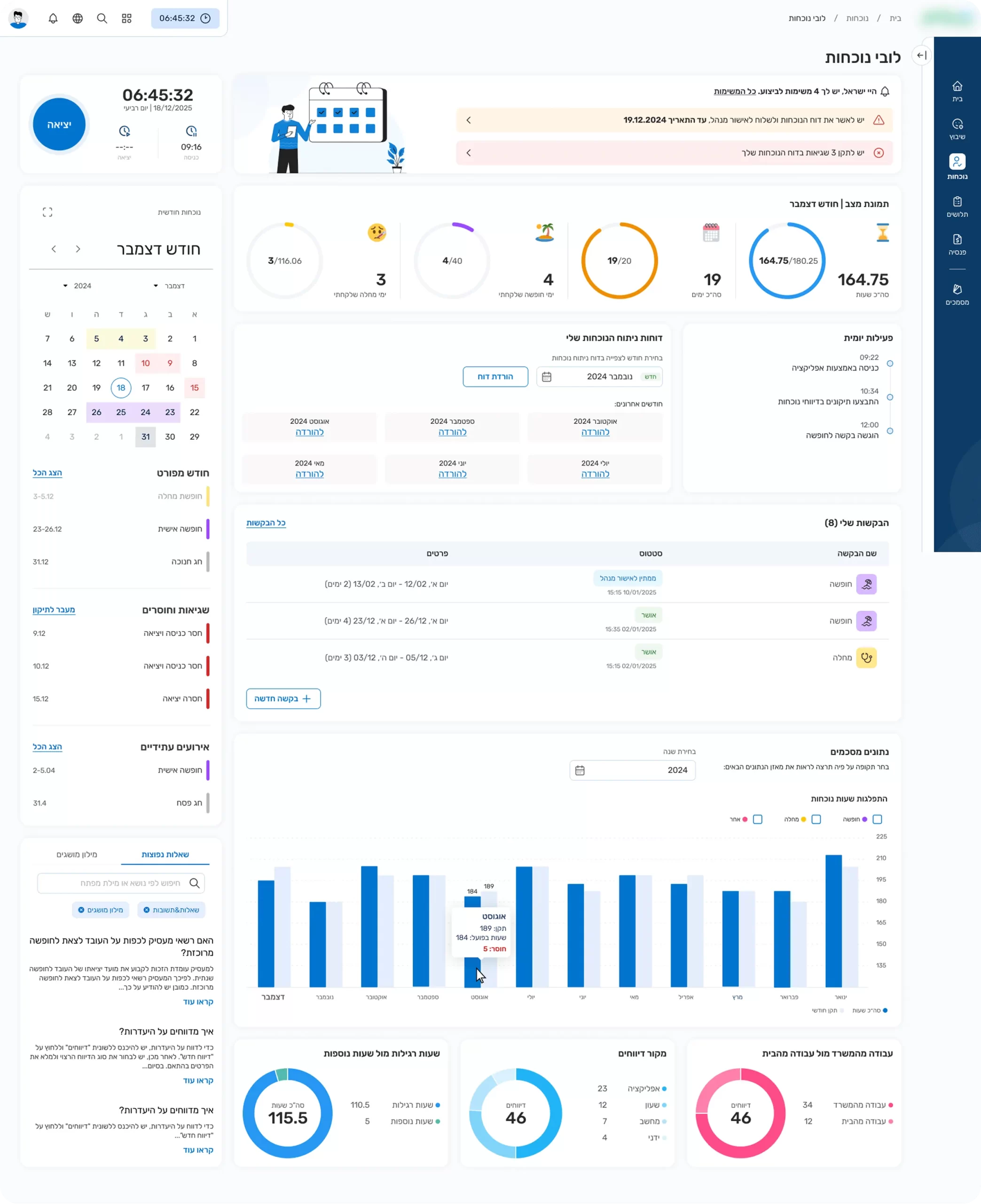
Semi-circular Progress Bar: Added a visual meter clearly showing worked hours against standard requirements
Hover Tooltip for Remaining Hours: During client consultation, we discussed whether to display total worked hours or remaining hours. Both approaches had valid arguments, with concerns that showing remaining hours might encourage "laziness". The solution was to show worked hours by default with remaining hours revealed on hover.
Balanced Visual Hierarchy: Redesigned to guide users naturally from current month information to attendance reporting without overemphasizing specific elements
Explicit Missing Entries Display: Clear indication of missing records count with visual markers for problematic entries. Proposed click-to-filter or jump-to-next-issue functionality (client liked both concepts, decision pending)
Design System
Our design system is built on Material 3 as a foundation, ensuring consistency while adapting it to our platform’s visual language.
Accessibility
With a broad target audience, accessibility guided every design decision.
Additional screens
Calendar
Designed for users who prefer reporting via a calendar and for easier viewing of upcoming dates
Attendance Dashboard
This might be my next case study! So here’s a little sneak peek