An AI-powered wellness app that analyzes voice patterns to detect stress and emotional tone, then delivers personalized vibroacoustic therapy to reduce stress, promote relaxation, and improve sleep.
My Role
Sole UX/UI Designer – responsible for research, wireframes, high-fidelity UI design, and developer handoff.
Note on confidentiality: Certain elements such as the client’s name, logo, and identifying details have been intentionally omitted. Thank you for your understanding.
A digital health startup providing an AI-driven vibroacoustic therapy app. By analyzing voice patterns in real time, it delivers personalized sound sessions to reduce stress, improve sleep, and restore balance.
The Challenge
People with PTSD often struggle to fall asleep and stay asleep. They also feel helpless and uncertain about their mental state, which worsens their distress. Accessing effective treatment is often difficult and expensive, leaving many without the help they need.
The Solution
A mobile app that provides personalized, real-time treatments using sound and vibrations to help users sleep, offering an affordable and always-accessible solution tailored to their condition.
Competitive Analysis
I conducted a competitive analysis of several applications, including both direct and indirect competitors. Below are the four most relevant competitors that provided key insights for our design strategy:
Scroll
Wysa
BetterSleep
Headspace
Shazam
Core Use Case
Mental health support via AI chatbot conversations
Improve sleep quality through soundscapes and relaxation tools
Mindfulness and meditation practice for stress reduction and focus
Identify songs instantly by listening
Feedback Loop
Self-report check-ins
Sleep logs (manual/implicit)
Streaks, progress
Instant match result
Notifications
Gentle nudges, streaks
Bedtime reminders
Daily mindfulness nudges
Minimal
Design Tone
Conversational, calm, pastel colors, warm and empathetic tone, unobtrusive menus
Dark theme with soothing visuals, Cozy, intuitive controls
Helps many users feel supported; good for coping skills practice
Widely praised for aiding sleep onset and relaxation; effective custom mixes
Strong research support; proven stress & mindfulness benefits; requires consistency
Extremely accurate and fast; highly satisfying UX; “wow” factor drives massive adoption
Strength Edge
Engages when distressed
Customizable soundscapes
Habit building & education
Frictionless single action
Weakness Risk
Chat fatigue
Can feel “content heavy”
Time commitment
Narrow use case
Key Takeaways
Compassionate microcopy and gentle check-ins create a supportive, non-judgmental atmosphere during moments of distress
A calming nighttime UX with dark visuals and intuitive controls fosters relaxation and ease of use
An approachable, playful design combined with progress tracking strengthens engagement and encourages habit formation
A frictionless moment where one action gives an instant, tailored recommendation, enhances user delight and trust
User Research & Persona
The client provided comprehensive user research data and insights from their existing user base. Based on this information, I developed a detailed user persona that guided all design decisions throughout the project
David Levi, 37, Married +2, Warehouse worker in logistics
“I feel like I can’t be the father and husband I want to be. I come home exhausted, can’t fall asleep at night – and everything just blurs together.”
Pain points
Suffers from post-trauma that causes insomnia.
Sleepless nights lead to severe fatigue during the day and mistakes at work.
Financial struggles and fear of losing his job.
Sense of guilt at home: tired, short-tempered with his kids, and less present with his wife.
Motivations
Sleep well at night in order to function during the day.
Reduce dependency on sleeping pills.
Keep his job and avoid mistakes.
Be a more patient and energetic father.
Usage Scenario
At night, David tosses and turns in bed, feeling his heart race and tension building. He opens the app, and records his voice. The app detects a high level of anxiety and recommends a tailored treatment. After completing the session, David feels calmer and eventually falls asleep.
In the morning, the app asks: “How did you sleep?” David rates his sleep quality, and the app logs the data, offers small tips for improvement, and displays a progress graph, encouraging him to stay consistent.
The UX Screens
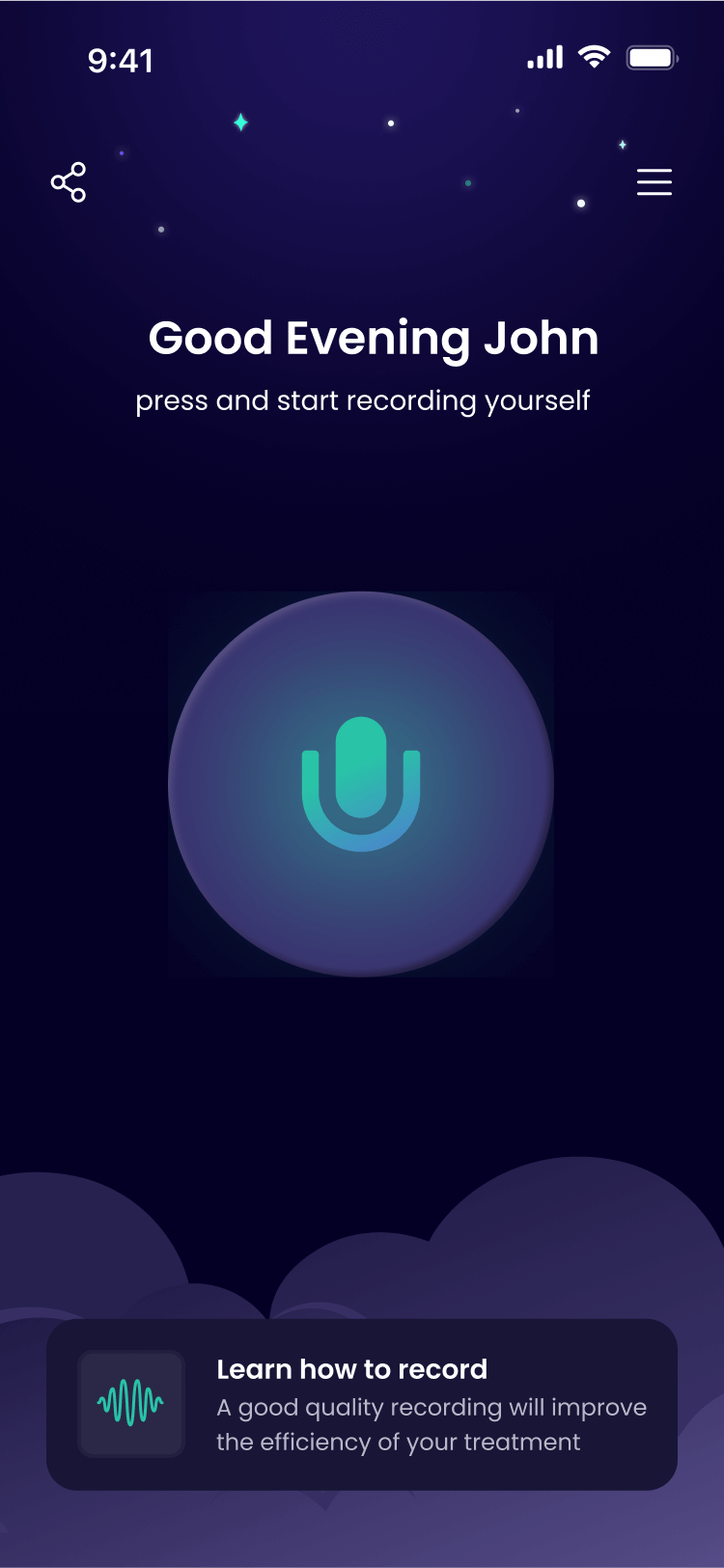
My solution focuses on simplicity and immediate relief. Inspired by Shazam’s frictionless approach, I centered the experience around one key action – voice recording – that instantly assesses anxiety levels and delivers personalized treatment. The streamlined flow guides users from recording through treatment to optional calming sounds, ensuring the app remains intuitive and directly addresses users’ nighttime anxiety needs.
UI Concepts
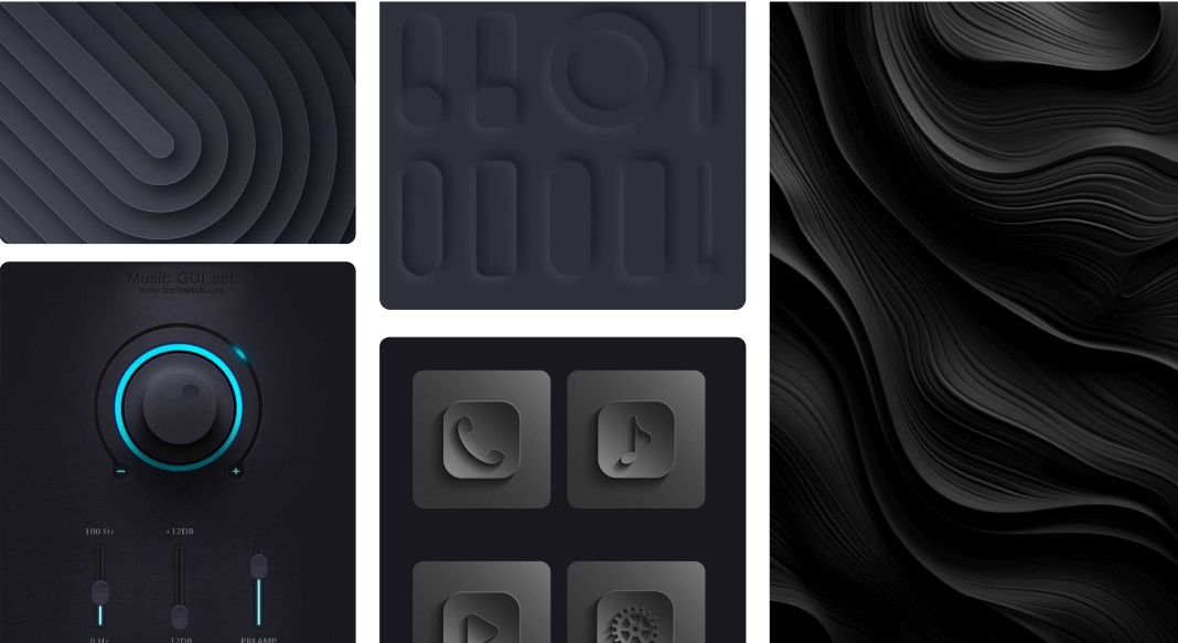
Step 1: Establishing the Visual Language
When I presented the two design concepts to the client, he was enthusiastic about both and asked if I could create a combined style. He particularly admired the three-dimensional, standout look of the Neumorphism design and the “spacey,” nighttime feel of the Neon concept, along with its glowing purple and green colors.
Concept 1: Neon
Concept 2: Neumorphism
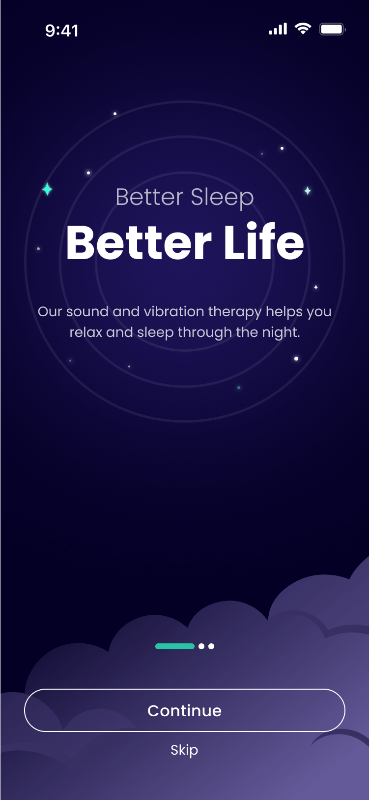
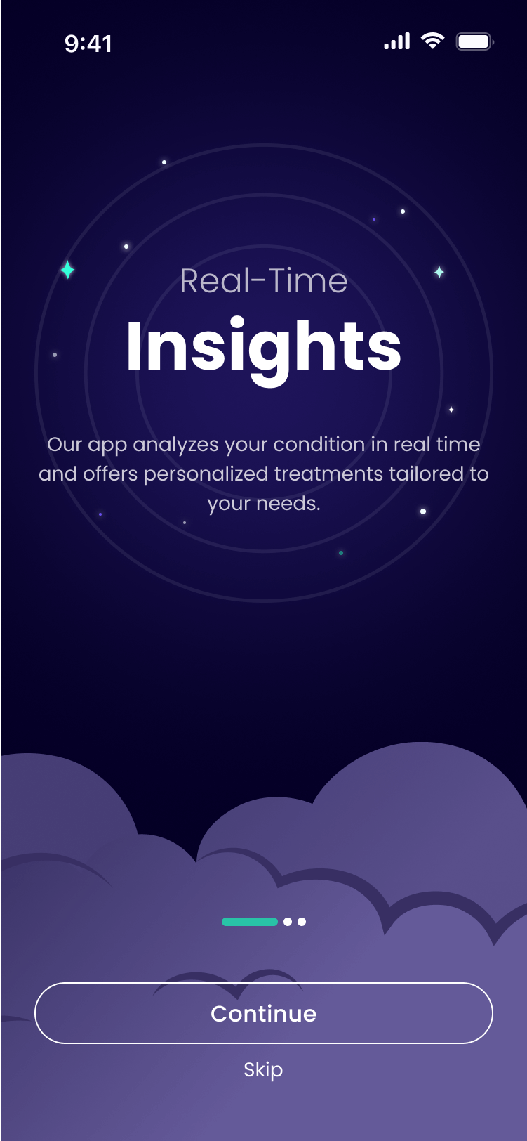
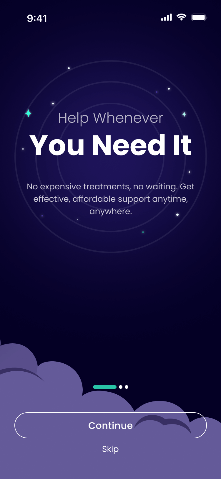
Step 2: Designing the Initial User Experience
Following the establishment of the visual language, the next step was to design the onboarding flow. I presented two concepts:
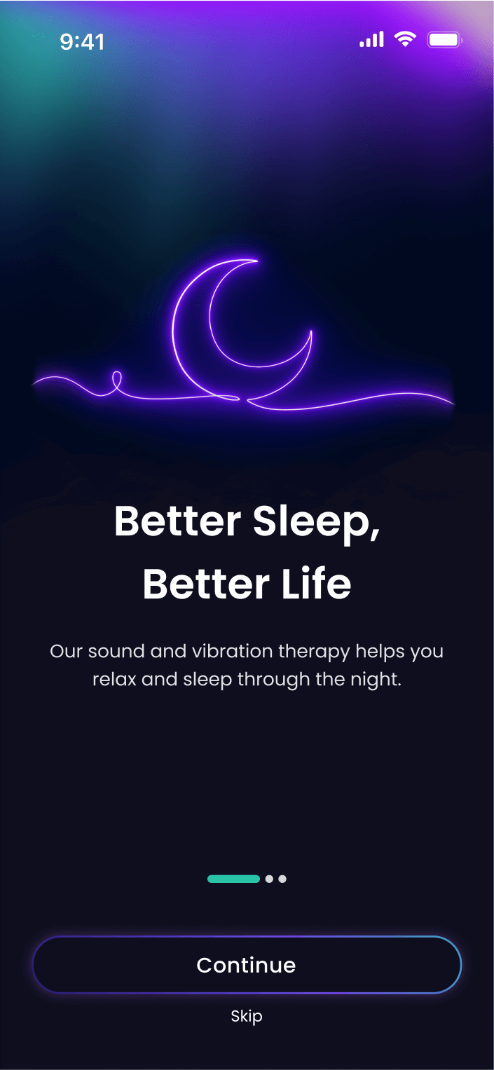
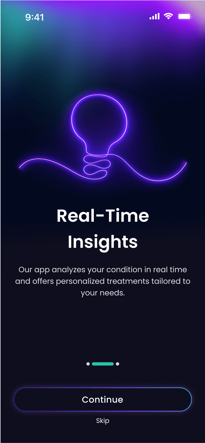
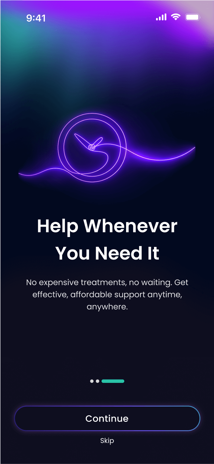
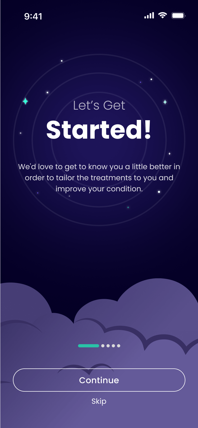
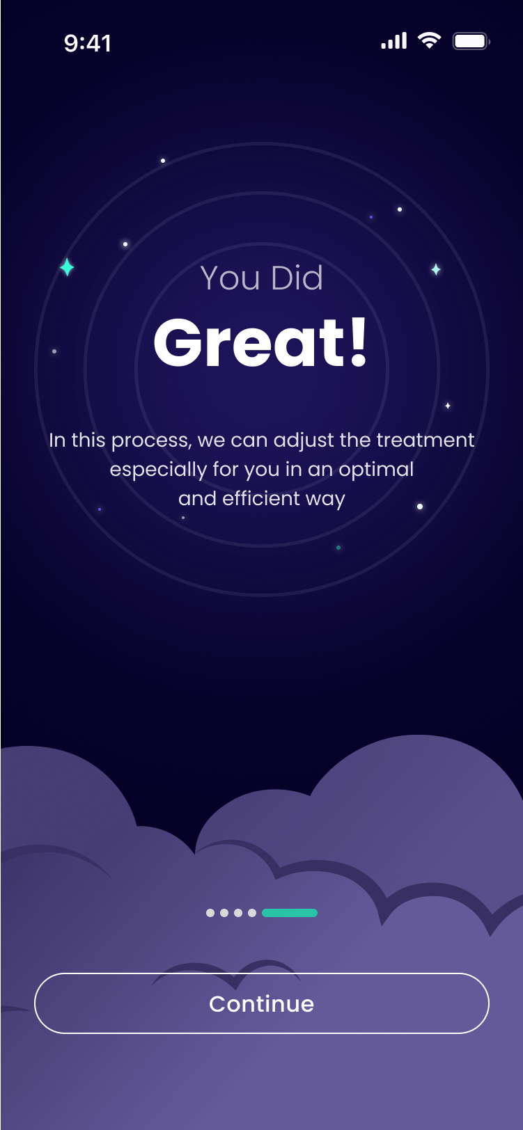
Concept 1 (Client's Choice): clouds and stars, emphasizing a sleep-and-night theme
Concept 2: inspired by the Northern Lights, highlighting the neon aesthetic with sound-based illustrations
Step 3: Implementing the main interface
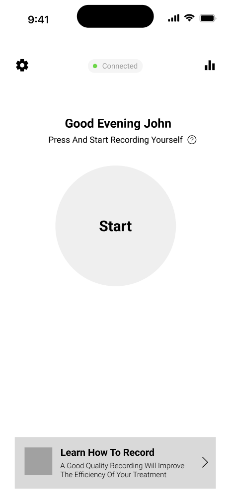
With the core visual language and the nighttime theme established, I used these concepts to design the main interface, creating two distinct options for the main button on the homepage. The client ultimately chose Option 2, which served as our primary direction.
Option 1
Option 2 (Client's Choice)
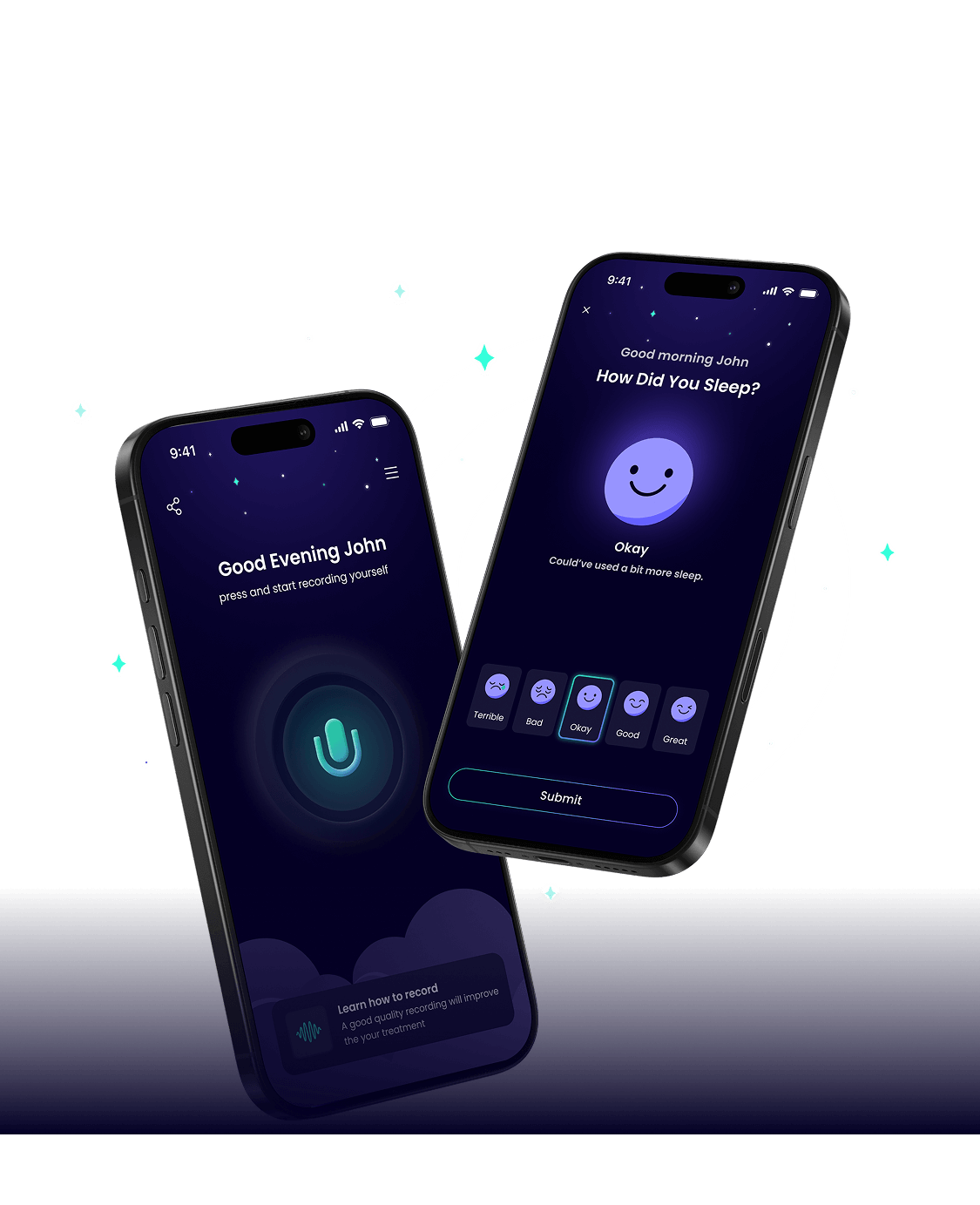
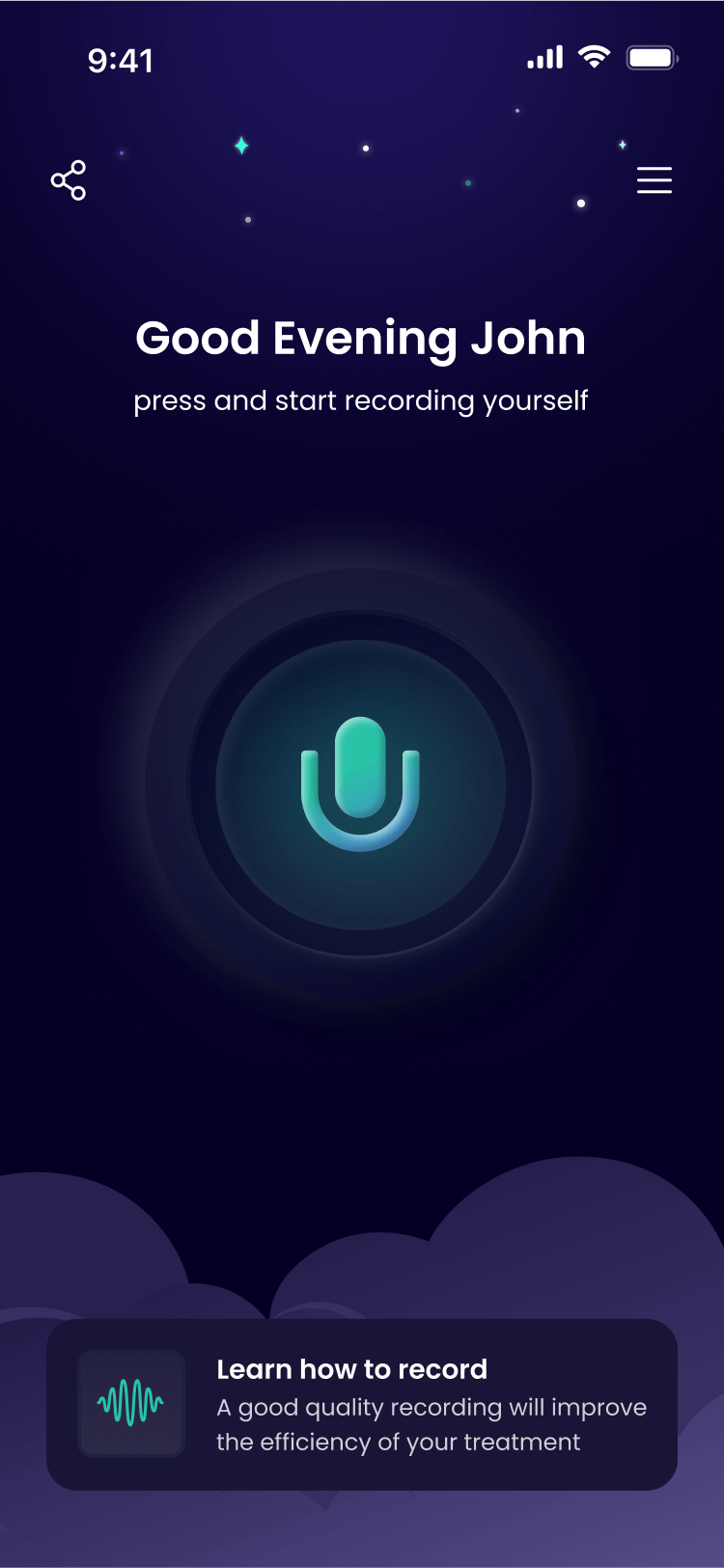
This choice set the tone for the entire application. The final design combines neumorphic elements with a neon glow in his preferred purple and green palette, incorporating sleep elements like clouds, stars, and moon throughout the interface.
The UI Screens
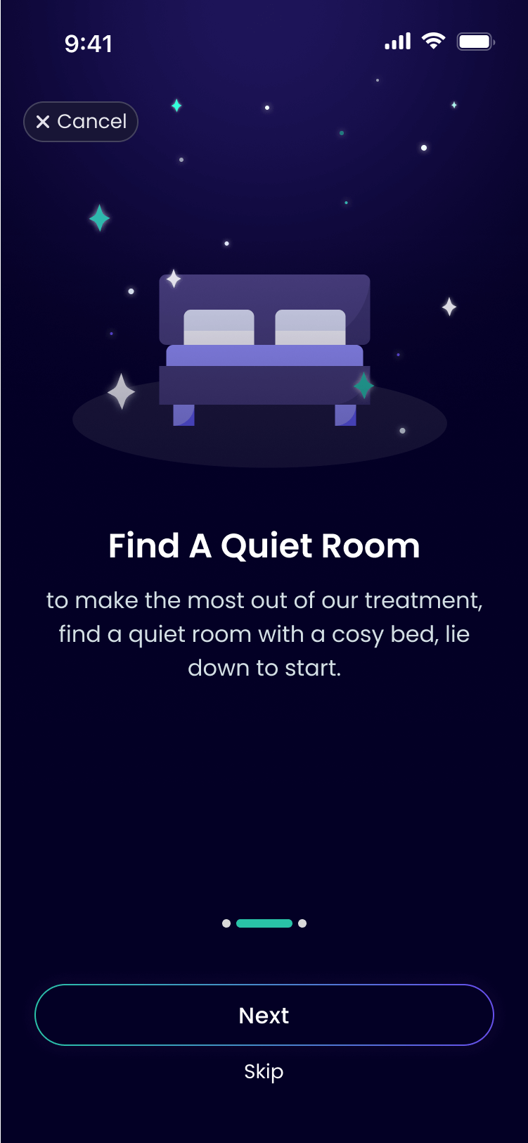
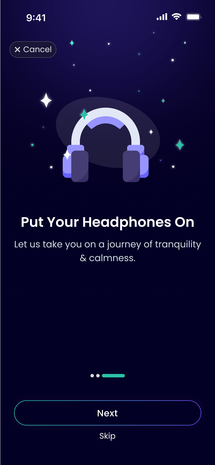
Intro Screens
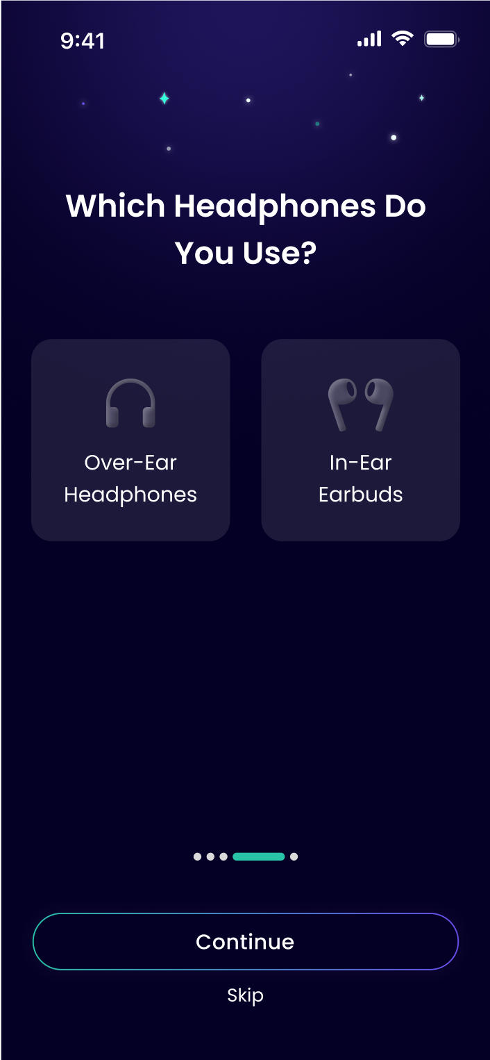
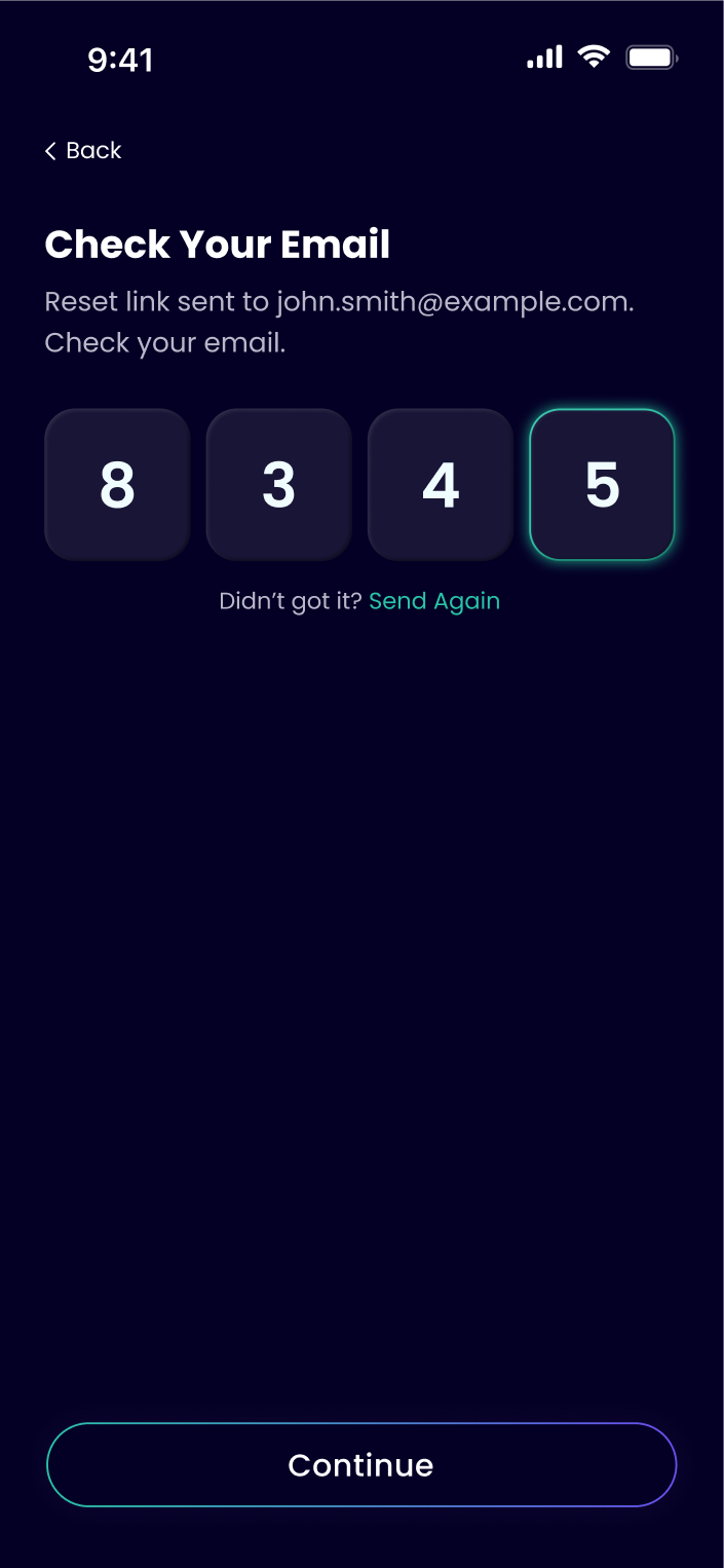
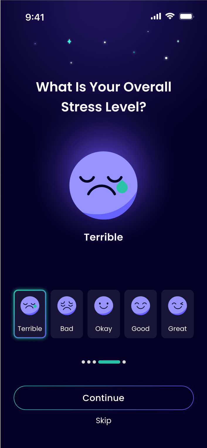
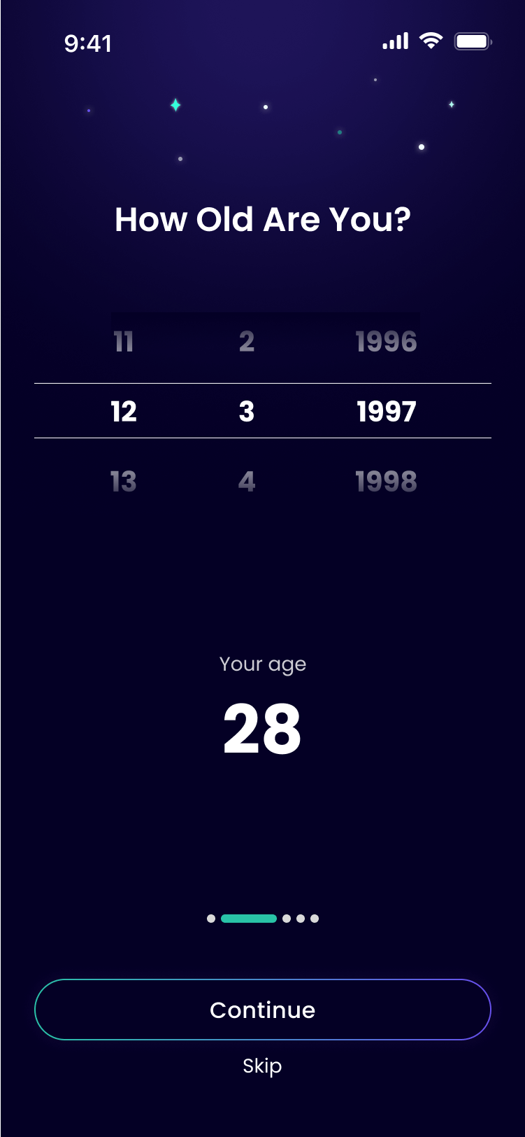
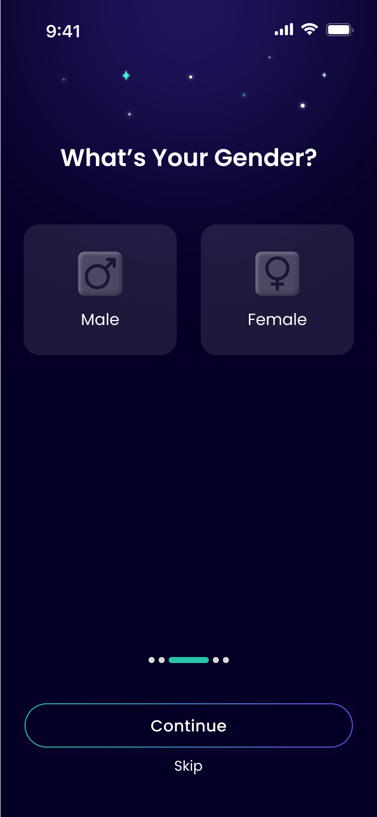
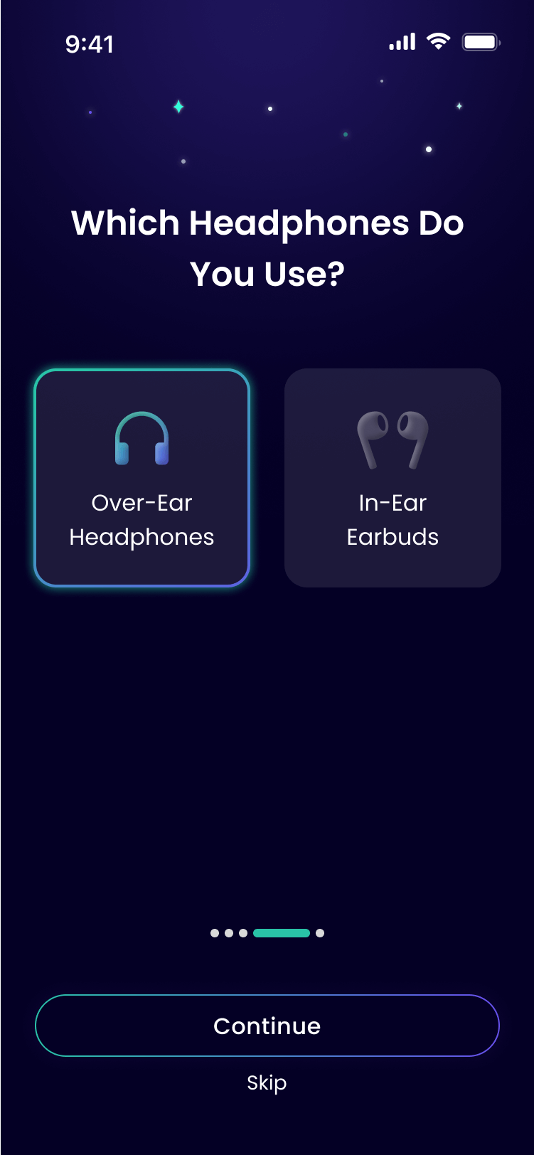
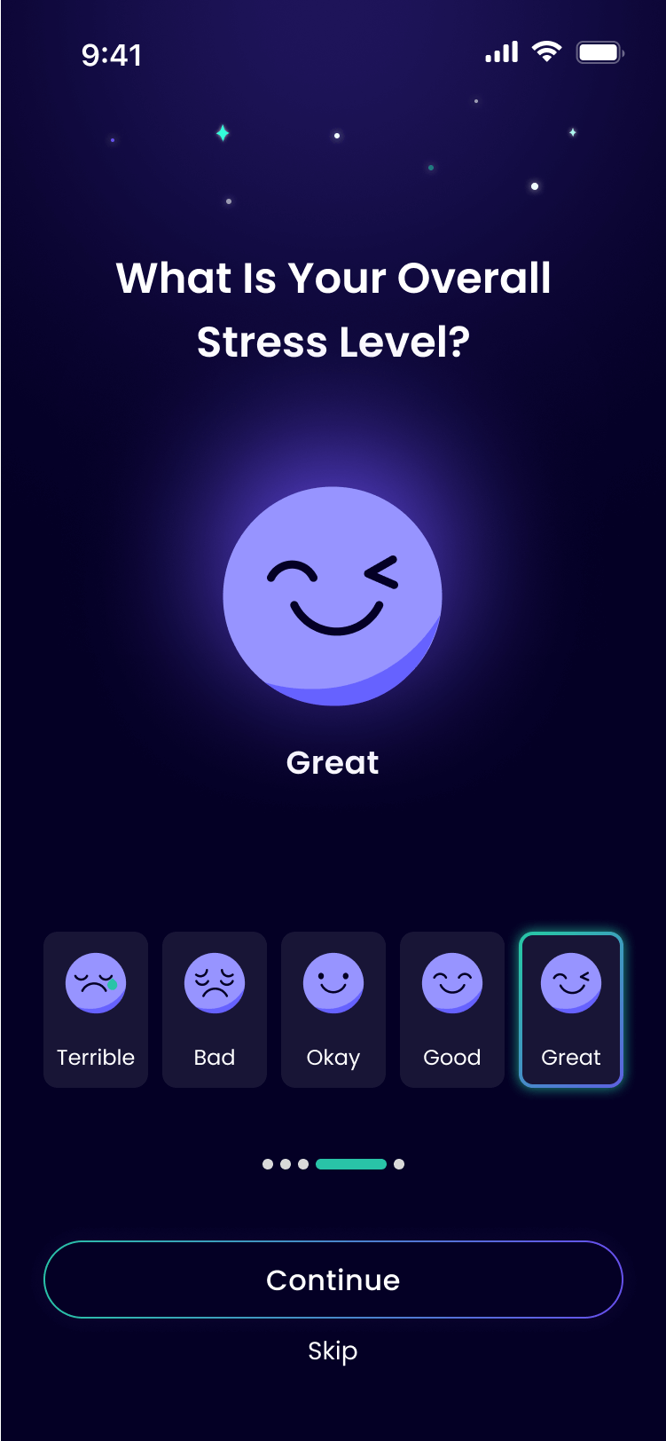
Onboarding
The user answers a few questions, to ensure the best personalization
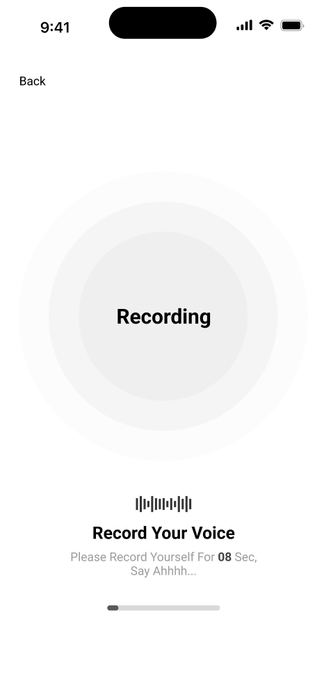
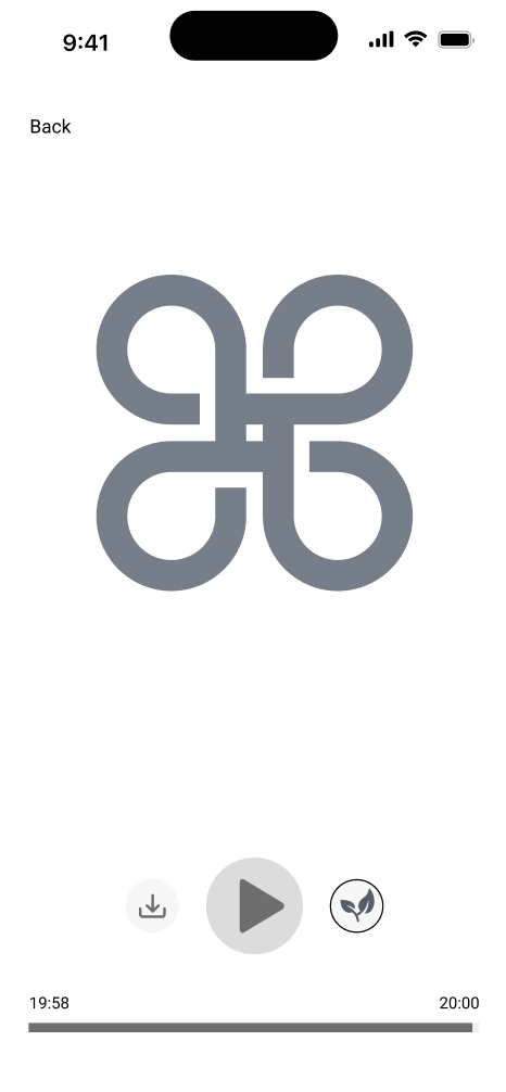
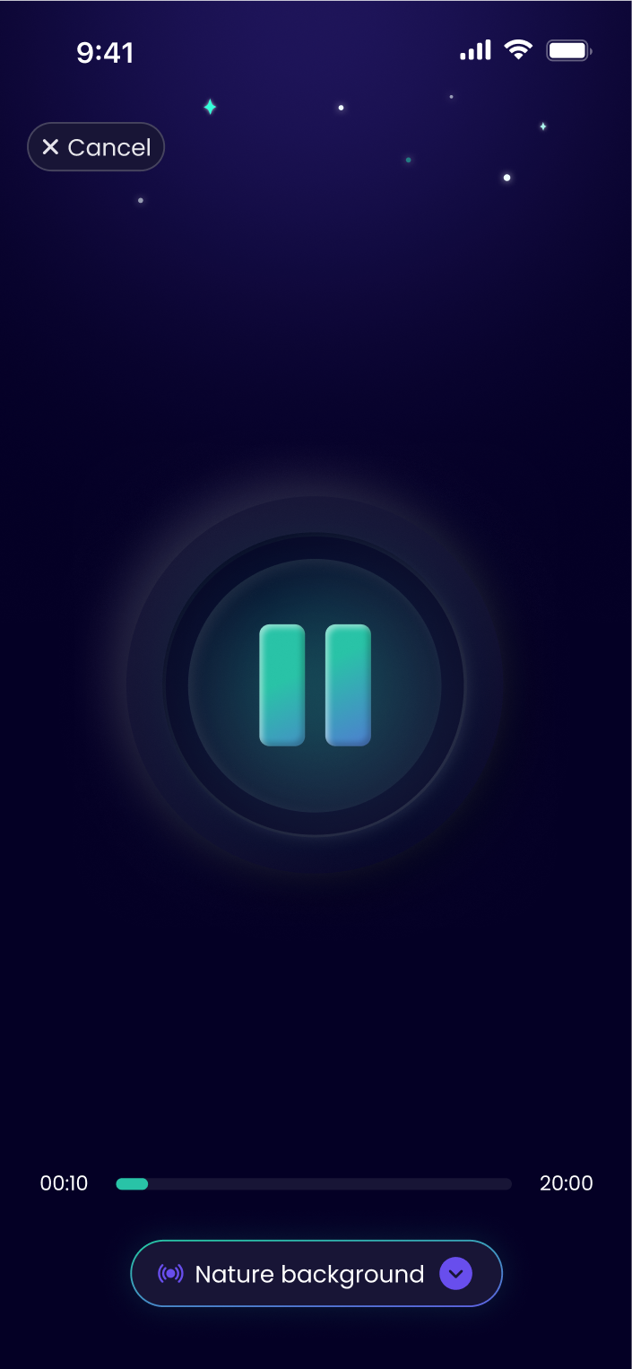
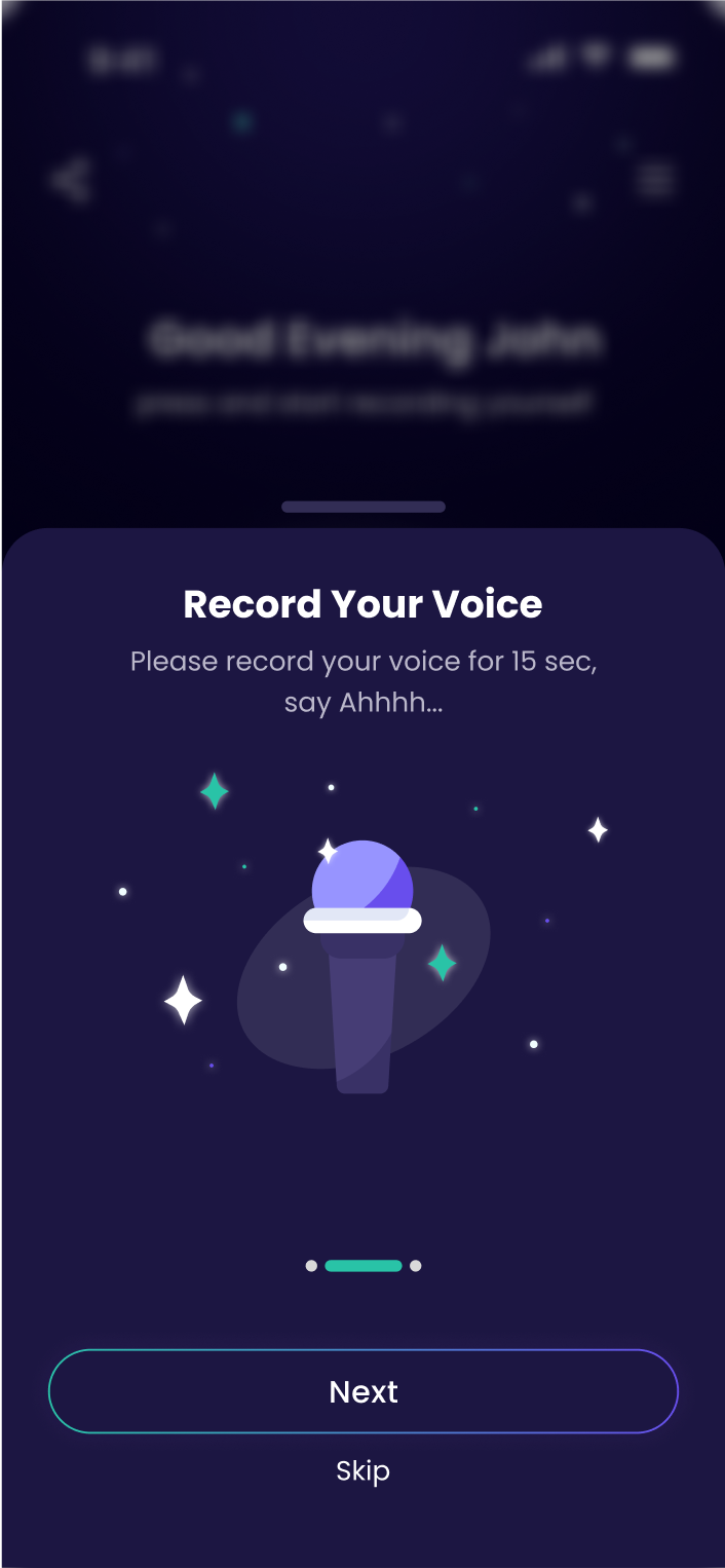
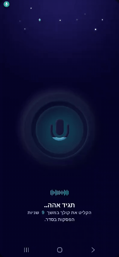
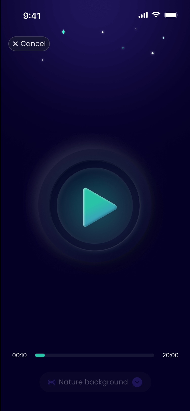
Recording
A live in-development demo (in Hebrew) showcasing a 10-second voice recording
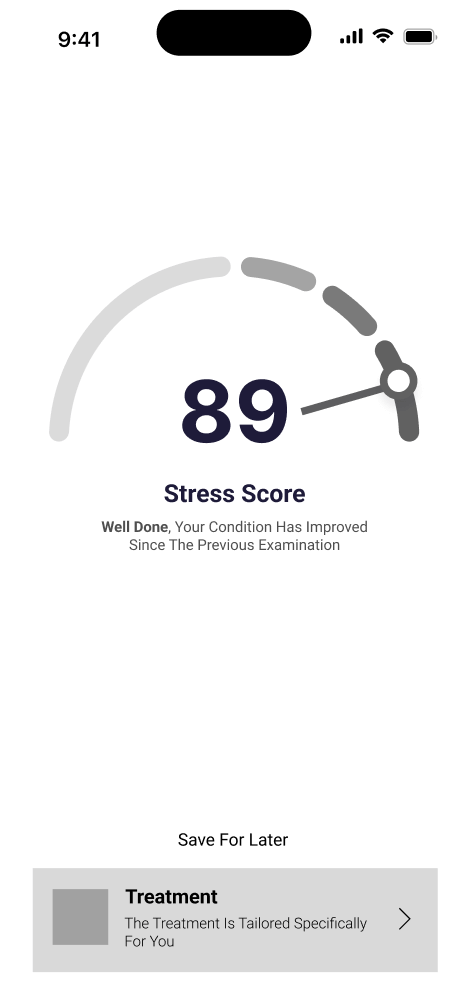
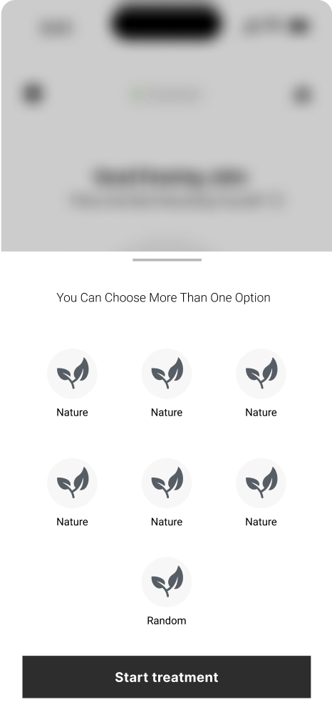
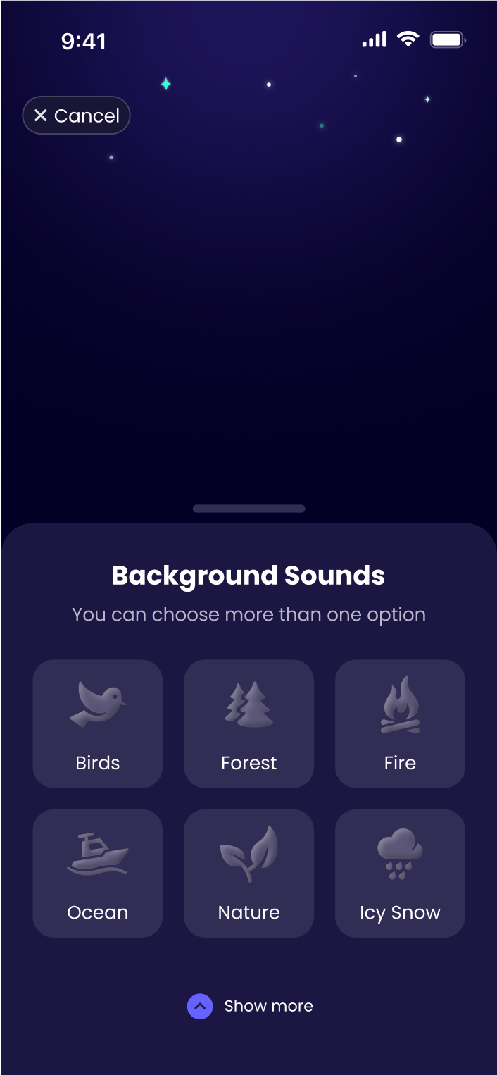
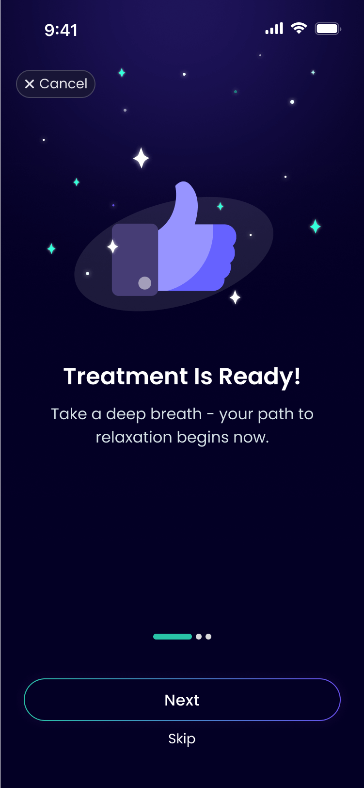
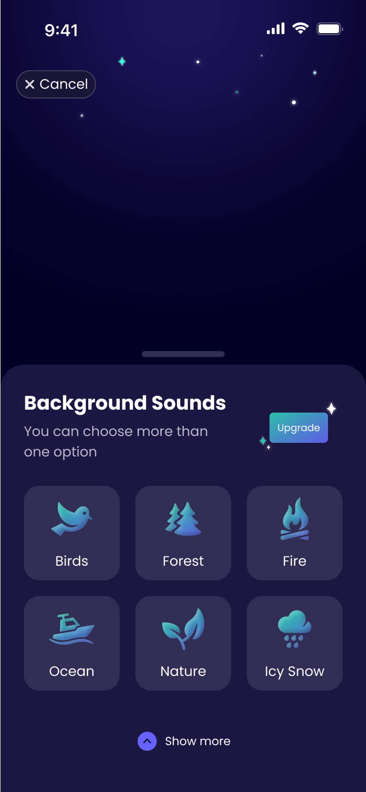
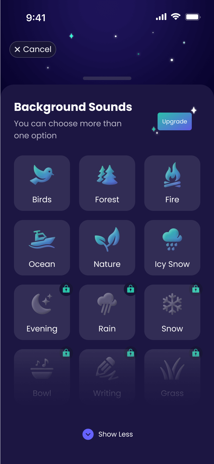
Treatment
A brief three-step guide introduces the treatment, followed by an option to add background sounds, enhancing focus and creating a more effective therapy experience
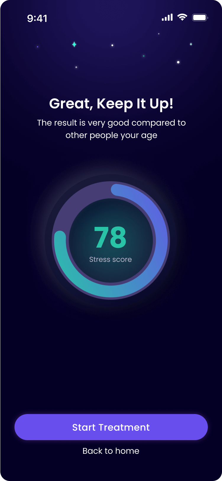
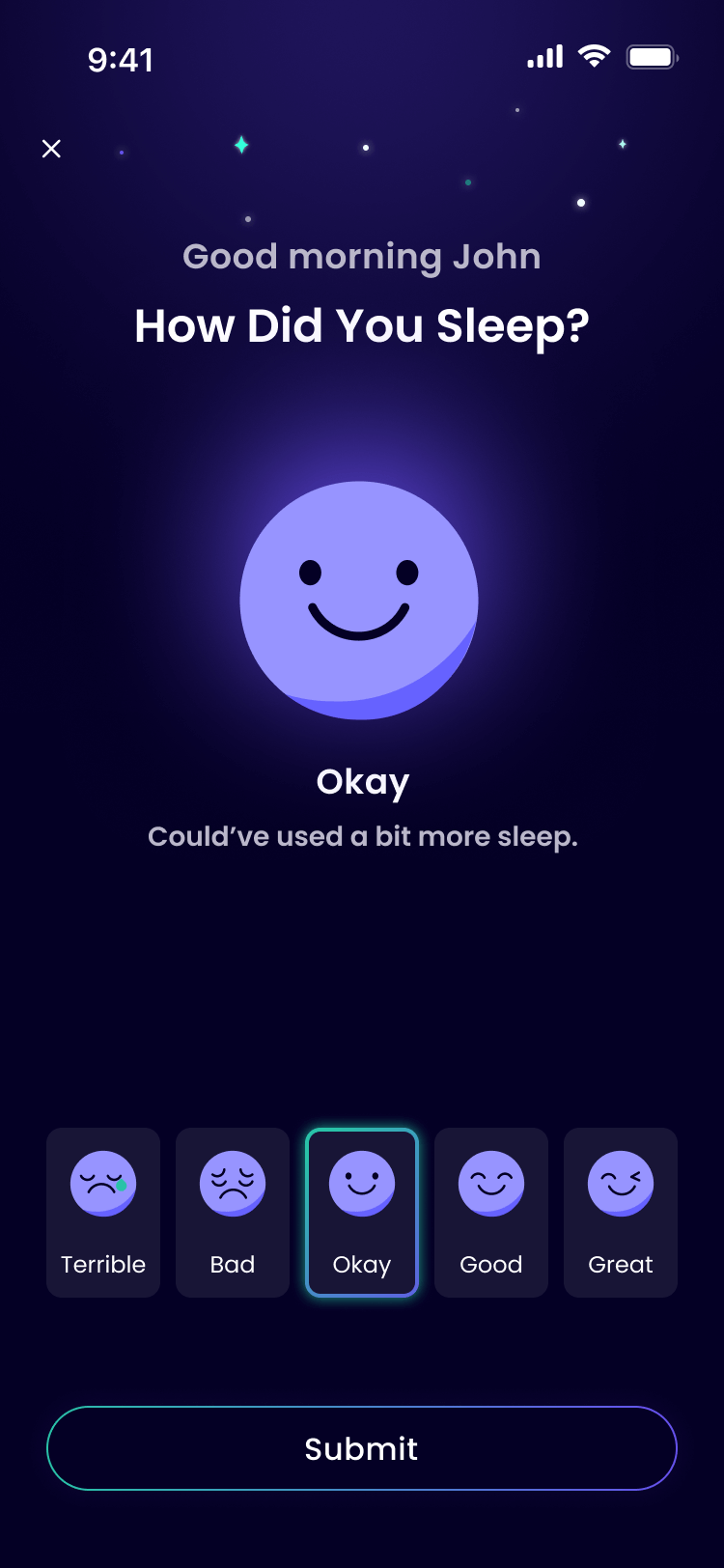
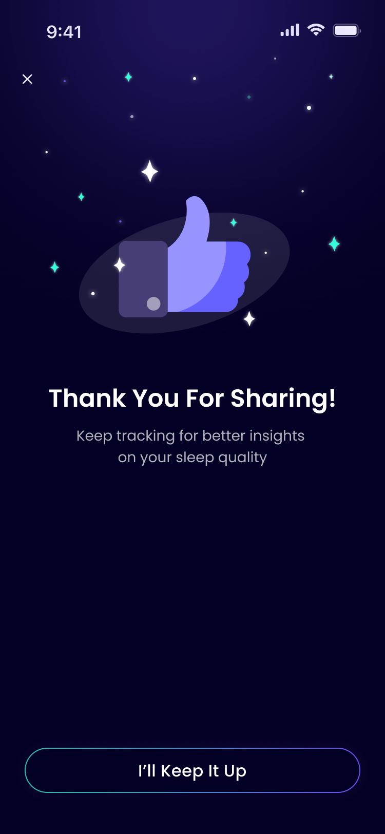
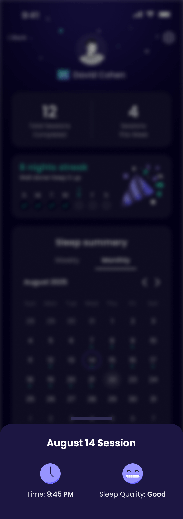
Checkup
After waking up, the user logs their sleep. The input powers smarter therapy – ongoing feedback refines and personalizes each session for better results
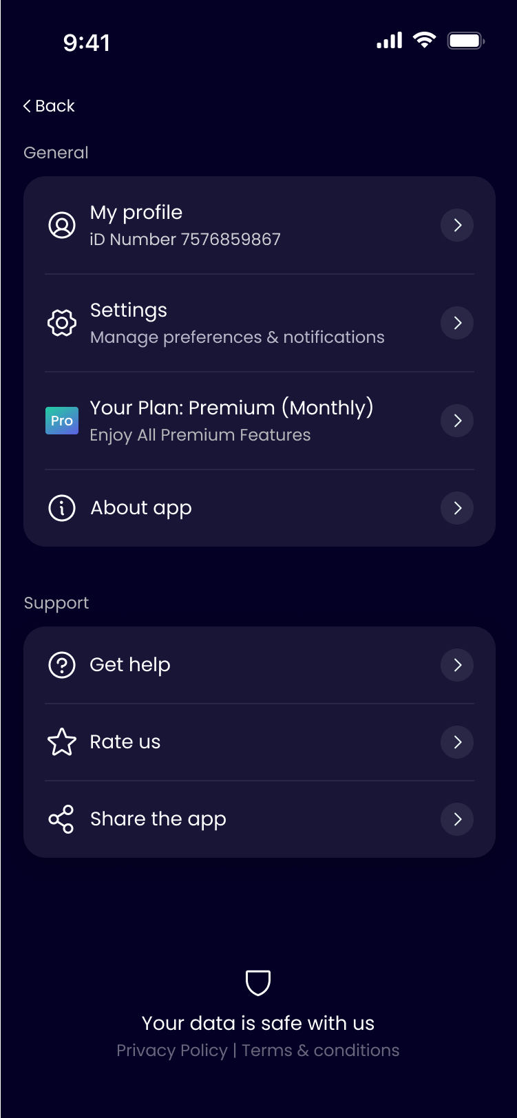
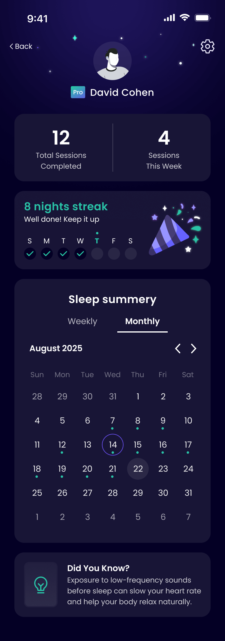
Profile
A user profile displaying session details on a weekly or monthly basis, tracking session duration and sleep quality, and featuring streaks to encourage consistent therapy